
Are you experiencing lower sales?
If so, the culprit might be your eCommerce mobile site’s user experience (UX).
In today’s digital landscape, where mobile commerce is on the rise, providing a seamless and enjoyable shopping experience on smartphones and tablets is essential for driving conversions and retaining customers.
In this article, we’ll explore mobile eCommerce best practices to enhance the UX of your mobile online store, helping you boost sales, improve customer satisfaction, and stay ahead of the competition.
Let’s jump right in!
How to Improve the UX of Your eCommerce Mobile Website
Follow these mobile commerce best practices to level up your eCommerce mobile UX.
1. Consider Minimalist Design
Minimalist design for a mobile eCommerce site refers to a design approach that prioritizes simplicity, clarity, and functionality.
To create a minimalist mobile-friendly eCommerce website, designers need to determine the site’s core – the website’s main features that include:
- Login and sign up
- Product search
- Product listing
- Add to cart
- Checkout
The desktop version can have more features, but keeping the mobile site’s features minimalist is important to avoid users feeling overwhelmed with abundant options on a small screen.
Besides simplified features, a clean layout is also the pillar of a minimalist design.
It refers to an uncluttered layout with ample white space to allow content to breathe.
Each element on the page is carefully considered and strategically placed to enhance visual hierarchy and readability.
Minimalist designs also typically use a limited color palette, often consisting of neutral tones and a few accent colors.
This creates a cohesive and harmonious visual experience while reducing visual distractions.
An ideal example of a minimalist design comes from a Japanese retail company, MUJI.

Similar to its products that commit to simplicity, sustainability, and practicality, MUJI’s eCommerce website also reflects the brand’s philosophy of “no-brand quality goods” with its minimalist design approach:
- Simple layouts
- Neutral color schemes
- Clean typography.
The focus is on showcasing MUJI’s products in a clean and organized manner, allowing users to easily explore and purchase items.
2. Level Up Your Navigation
Seamless navigation is essential for a mobile eCommerce site because it directly impacts the UX and ultimately influences conversion rates.
When users can easily find what they’re looking for and navigate through the site effortlessly, they are more likely to stay engaged and complete their purchases.
One way to deliver seamless navigation is to use a slideout menu.
A slideout menu, also known as a hamburger menu, is a navigation element commonly used in eCommerce web development for mobile.
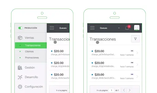
It typically appears as three horizontal lines stacked on top of each other, resembling a hamburger, hence the name.
When users tap or swipe on the icon, it triggers a panel to slide out from the side of the screen and generally occupies the full screen, revealing navigation options and potentially social media icons.
Then, the three-line icon should change into the “X” icon to indicate a close button when users want to dismiss the menu.
Another method to improve the UX of your eCommerce website in terms of navigation is to implement an expandable search.

This feature allows users to access the search functionality easily by tapping on a search icon or entering a keyword directly.
When activated, the search bar expands to display additional search options, such as filters, sorting preferences, and autocomplete suggestions.
By providing a seamless search experience, users can quickly find the products they’re looking for, leading to higher satisfaction and increased conversion rates.
You can also level up your website navigation by offering voice-activated navigation.
This means that you allow users to browse products, search for items, and complete transactions using voice commands.
Implementing this offers a convenient and hands-free way for users to interact with your eCommerce website.
It also helps you increase revenue as more people rely on voice-activated assistants such as Siri, Google Assistant, and Alexa to search for products and make purchases.
In fact, 50% of consumers have purchased a product using their voice assistant, and an additional 25% would consider doing so in the future.
3. Incorporate Pinch and Double-Tap Zoom Features
Pinch and double-tap zoom features can enhance the mobile eCommerce experience by allowing users to zoom in or out on product images to provide a closer look at the details, especially on smaller screens.

These intuitive gestures help users examine products, leading to higher engagement and potentially increased sales.
A fashion retailer ASOS implements pinch and double-tap zoom functionality on its mobile website, enabling users to zoom in on clothing items to see fabric textures and details.
This feature enhances the browsing experience and helps customers visualize products more effectively.
For expert implementation, consider using eCommerce software development services to ensure a smooth and user-friendly zoom functionality tailored to your specific business needs.
Alternatively, hire an eCommerce mobile app development company to build an eCommerce app.
With a dedicated mobile app, you can deliver a more seamless shopping experience with custom functionalities than a website alone.
You can guide customers to download the app directly from your website using a prominent banner or call-to-action (CTA) button, just like ASOS does.
4. Make Your Copy User-centered
Making your copy user-centered is important for better mobile eCommerce websites.
When copywriting is focused on the user, it becomes more relevant, relatable, and actionable, leading to higher conversion rates and customer satisfaction.
Additionally, user-centered copywriting improves readability on mobile devices, where space is limited and attention spans are shorter.
This can ensure that users can quickly grasp the key information to make informed decisions.
Some mobile eCommerce best practices for better copy include:
- Understand your audience. Tailor your copy to address their specific needs, preferences, and pain points.
- Use clear and concise language. Avoid using jargon and technical terms that may confuse users.
- Focus on benefits. Highlight your products or services’ benefits instead of just listing features. Explain how your offerings can solve problems or improve your customers’ lives.
- Optimize for mobile. Note that mobile users have limited screen space. Use short paragraphs, bullet points, and subheadings to break up the text and make it easier to read on smaller screens.
5. Streamline Registration and Checkout Flow
Streamlining registration and checkout flow involves optimizing the process of creating an account and completing a purchase on a mobile eCommerce website to make it as smooth and efficient as possible for users.
Here are several mobile commerce best practices to make the registration and checkout flow smoother:
- Simplify account creation. Minimize the number of steps required to create an account by offering social login options or allowing users to sign up with their email address and a password of their choice.
- Guest checkout option. Provide an option for users to checkout as a guest without creating an account, speeding up the checkout process, especially for first-time visitors.
- Autofill and autocomplete. These features pre-fill form fields with saved information from previous interactions, such as shipping and billing addresses. This saves time and reduces the effort required from users.
- Mobile-friendly design. Ensure that form fields and buttons are large enough and spaced properly for easy tapping and navigation on touch screens.
- Multiple payment options. Offer a variety of payment options to accommodate different user preferences, such as credit/debit cards, digital wallets, and alternative payment methods.
6. Create A Blog
Creating a blog can significantly enhance the UX of an eCommerce mobile website by providing valuable content and improving search engine visibility.
A blog allows you to publish informative articles related to your industry or niche.
Offering valuable insights and advice will help users make informed purchasing decisions, thereby enhancing their overall shopping experience.
Updating your blog with new articles and optimizing them for relevant keywords can also improve the website’s visibility in search engine results pages (SERPs), attracting more organic traffic to your site and potentially increasing sales.
To reap the benefits of a blog, ensure you publish high-quality content.
Write well-researched, informative, and engaging blog posts that provide value to your audience.
Furthermore, use a mix of formats, such as articles, how-to guides, videos, infographics, and case studies, to keep your content diverse and engaging.
Airbnb is known for its high-quality blog, which features a variety of content aimed at travelers and hosts alike.
The Airbnb Newsroom covers a wide range of topics, including travel tips, destination guides, host stories, and company news.

With its visually appealing layout, engaging storytelling, and useful information, Airbnb’s blog serves as a valuable resource for travelers seeking inspiration and advice for their next trip.
7. Apply Emerging Technologies
Integrating artificial intelligence(AI), virtual reality (VR), and augmented reality (AR) technologies into mobile eCommerce can significantly improve the UX by offering personalized interactions and immersive shopping experiences.
One of the most common AI-based solutions in the eCommerce industry is chatbots.
Chatbots can provide round-the-clock customer support, answering common questions, assisting with product inquiries, and resolving issues promptly, even outside of business hours.
They can also deliver personalized product recommendations and suggestions by analyzing user preferences and browsing history.
An example of VR is 360-degree product views.
This AR technology allows users to interact with products from all angles, enabling them to rotate, zoom in, and explore products in detail.
You can also use VR to improve your eCommerce mobile site.
Implementing VR technology enables virtual try-on experiences for products like apparel, accessories, and cosmetics.
This allows users to visualize how products will look on themselves in real-time using AR overlays or VR simulations, enhancing confidence in purchasing decisions and reducing the likelihood of returns.
A brand that uses VR in its online store is Warby Parker.

This eyewear brand allows customers to virtually try on glasses using their mobile app or website.
Users can upload a photo or use their device’s camera to see how different frames look on their faces from various angles.
8. Always Test Your Website
Whatever mobile eCommerce best practices you do, always incorporate testing.
Testing ensures that your website provides a seamless and intuitive UX across various mobile devices.
It also helps identify performance issues such as slow page load times, broken links, or unresponsive design elements, allowing you to optimize your website’s performance for mobile users.
To effectively test your eCommerce site for mobile, consider the following strategies:
- Responsive design testing. Ensure that your website is optimized for mobile devices by testing its responsiveness across various screen sizes and resolutions.
- Browser compatibility testing. Test your website on different mobile browsers (e.g., Chrome, Safari, Firefox) and operating systems (iOS, Android) to ensure compatibility.
- Performance testing. Use tools like Google PageSpeed Insights or Lighthouse to analyze your website’s performance and identify areas for improvement.
- UX testing. Conduct usability testing with real users to evaluate the effectiveness of your website’s design, navigation, and functionality.
- Security testing. Perform security audits and vulnerability assessments to identify and address potential security risks, such as data breaches or malware attacks.
- A/B testing. Experiment with different design elements, content layouts, and call-to-action buttons to determine the most effective configurations for driving conversions.
Conclusion
Optimizing the UX of your eCommerce mobile site is crucial for driving sales and ensuring customer satisfaction.
To optimize it, start implementing mobile commerce best practices discussed in this article!
From improving navigation and integrating innovative features like augmented reality, you can create a mobile shopping experience that resonates with your customers and keeps them coming back for more.
Also, remember to continuously test and iterate on your site to identify areas for improvement and stay ahead of customer expectations and competition.
If you’re in doubt about how to do these strategies, you can consult with us for expert guidance.
Our eCommerce development services specialize in crafting seamless and engaging mobile shopping experiences tailored to your brand and audience.
From optimizing navigation to implementing innovative features like chatbots, we’re here to help you unlock the full potential of your eCommerce mobile site.
Ready to take your eCommerce mobile site to the next level?


