
Almost 50% of consumers worldwide use their mobile phones to shop online at least once a day.
With such a significant portion of potential customers, ensuring your online store is optimized for mobile use is essential.
In this article, we’ll explore how to develop a mobile-friendly eCommerce website to make sure you leverage the customer base potential.
You’ll get practical mobile eCommerce development tips, along with the best tools and examples to help provide an exceptional shopping experience for users on smartphones and tablets.
At the end of this article, it’s up to you to implement the practices yourself or hire a reputable eCommerce web development company.
Let’s dive in!
9 Ways to Create A Mobile-Friendly eCommerce Website
Use a Responsive Theme
To build a mobile-friendly eCommerce website, the first step is to choose a responsive theme.
A responsive theme will adapt and adjust the layout, content, and functionality of your website based on the device’s screen size and resolution.
Start by researching popular eCommerce platforms like Shopify, WooCommerce, Magento, or BigCommerce, and browse their theme marketplaces.
These platforms generally offer responsive themes with various features and designs.
If nothing impresses you, explore theme marketplaces such as ThemeForest, TemplateMonster, or Creative Market.

They provide a vast selection of responsive themes for different eCommerce platforms.
Filter your search based on your platform, industry, and other specific requirements.
A key takeaway is to preview the demo sites for each theme.
Take the time to explore these demo sites on different devices (desktop, laptop, tablet, smartphone) to see how the theme adapts to various screen sizes.
Also, check user reviews and ratings for each theme you’re considering.
Look for themes with positive reviews, high ratings, and a significant number of downloads or purchases, as these indicate reliability and customer satisfaction.
If you’re interested in stepping up by making your site into an app, consider hiring eCommerce app development services that can build a custom, responsive design for your online store.
Reduce Unnecessary Scrolling
Reducing unnecessary scrolling is vital for creating a good eCommerce mobile user experience.
Excessive scrolling can frustrate users and make it challenging for them to find the information they need.
Meanwhile, minimizing scrolling allows users to access essential content quickly without having to navigate through lengthy pages.
This practice will keep them engaged and encourage them to explore your site further.
Here are some ways to reduce unnecessary scrolling:
- Prioritize essential content and place it at the top of the page to ensure it’s immediately visible without scrolling.
- Opt for a vertical layout rather than horizontal scrolling to ensure compatibility with mobile devices.
- Use accordions and tabs to organize and condense content, especially for long product descriptions, FAQs, or other detailed information.
- Keep important navigation elements such as headers, search bars, and contact buttons visible at the top or bottom of the screen by making them sticky for easy access.
- Add a back-to-top button to allow users to quickly return to the top of the page with a single tap.
Provide Comfortable Navigation
Creating a mobile-friendly online store requires comfortable navigation to help users explore your website, find information, and complete tasks, including those with disabilities or impairments.
To make accessible and comfortable navigation, eCommerce software developers or website developers need to design a clear and concise menu structure based on the device’s capabilities.
For example, Vitra, a Swiss furniture company, uses a hamburger menu on smartphones and keeps the number of menu items limited – it only uses six items, along with other important links like the account profile and wishlist button.
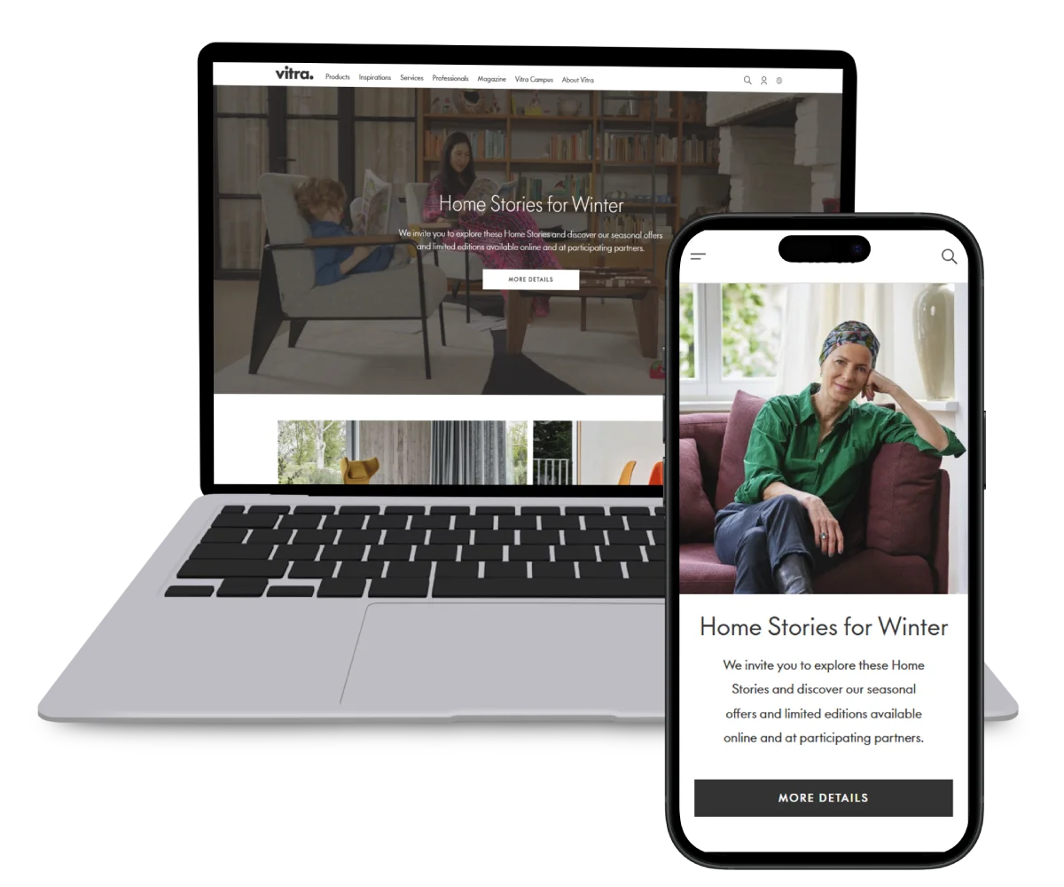
Meanwhile, the company displays the menu horizontally on tablets, similar to what users will see on desktops.
Another way to make sure your site is comfortable is by implementing a thumb-friendly layout.
This mobile-first eCommerce design requires you to place important navigation elements within easy reach of the user’s thumb.
Doing this aims to reduce the need for stretching or awkward finger movements.
Additionally, to create a comfortable design for all users, you have to make sure that your online store is accessible by:
- Using semantic HTML markup for navigation elements.
- Providing alternative text for images and captions or transcripts if your website contains multimedia content, such as videos or audio files.
- Ensuring that navigation can be easily operated using keyboard shortcuts or assistive technologies.
Prioritize Speed
Ensuring your site loads quickly is important for your eCommerce website development project.
In fact, more than 50% of mobile users will abandon a website if it takes more than three seconds to load.
To make your site load faster, consider enabling Accelerated Mobile Pages (AMP).
It’s a framework that helps speed up the load times of your mobile site.
This framework restricts HTML/CSS and JavaScript, compressing site data to eight times smaller than a regular mobile web page.
As a result, your site can load in up to four times faster loading processes.
Avoiding complex widgets is also effective for mobile optimization for eCommerce.
Minimize the use of complex widgets, such as carousels or sliders, as they can significantly impact page loading times on mobile devices.
Instead, opt for simpler design elements that are lightweight and load quickly.
Another method to make a fast-loading mobile eCommerce site is to optimize images to create the smallest size possible without losing the images’ overall quality.
Optimizing images on your online store is important because mobile devices have smaller bandwidth than desktops, resulting in large image files taking more time to load.
Many mobile users also use a limited data plan, so small image sizes can help them use less amount of data.
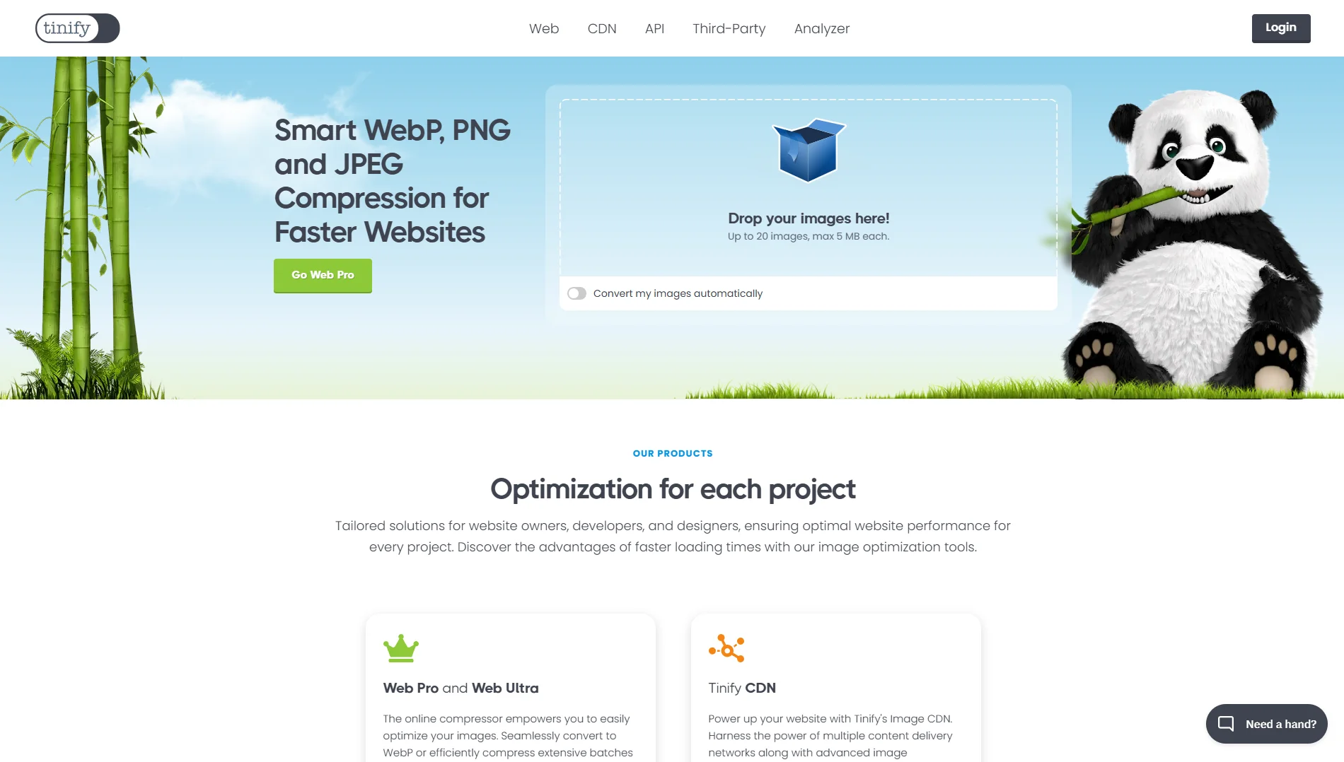
You can optimize your images using visual editing software like Photoshop or a web tool like TinyPNG.
Alternatively, install a plugin like ShortPixel if you use WordPress as your eCommerce platform.
Be Careful about Pop-ups
Displaying pop-ups on the desktop version may help increase conversions, and users don’t find them distracting because they’re easy to close.
In mobile devices, however, pop-ups can annoy visitors.
They can accidentally click on the pop-up which may direct them to a new page, leading to an unpleasant user experience and making them leave your site.
We recommend you entirely disable pop-ups on the mobile site.
However, use these strategies if you need them to promote your offers or certain products:
- Ensure that your popups provide relevant and valuable information, offers, or incentives to visitors.
- Avoid using full-screen pop-ups on your site, as they’ll hide the rest of the content on the screen.
- Provide clear and easily accessible close buttons or options for users to dismiss the popup if they’re not interested.
- Use timing triggers such as entrance, exit, or scroll-based popups rather than interrupting users immediately upon page load.
- Opting for alternatives such as a less-intrusive banner or a call-to-action (CTA) button that directs people to your offers.
Note that Google will penalize websites using intrusive pop-ups.
This means that the search engine will find your eCommerce website lacks accessibility if it incorporates too many or annoying pop-ups.
Optimize the Button Placement
Ensure that you make your CTA buttons easy to spot to prompt users to take specific actions, such as making a purchase or signing up for a newsletter, leading to higher conversion rates.
Well-optimized CTAs are generally large buttons.
On mobile devices, aim for a size of around 40-50 pixels in height and width, ensuring that it’s easily tappable with a thumb or finger.
However, regardless of the device, ensure that there is enough padding and spacing around the CTA button to make it stand out and prevent accidental clicks.
Aim for at least 10-20 pixels of padding on all sides.
For a better eCommerce mobile user experience, use clear and concise language for your CTAs to convey the action you want users to take.
Avoid long sentences and stick to actionable phrases like “Shop Now” or “Buy Here”.
To make your CTA buttons stand out, use contrasting colors that grab users’ attention.
Ensure the color choice aligns with your brand but still pops against the background.
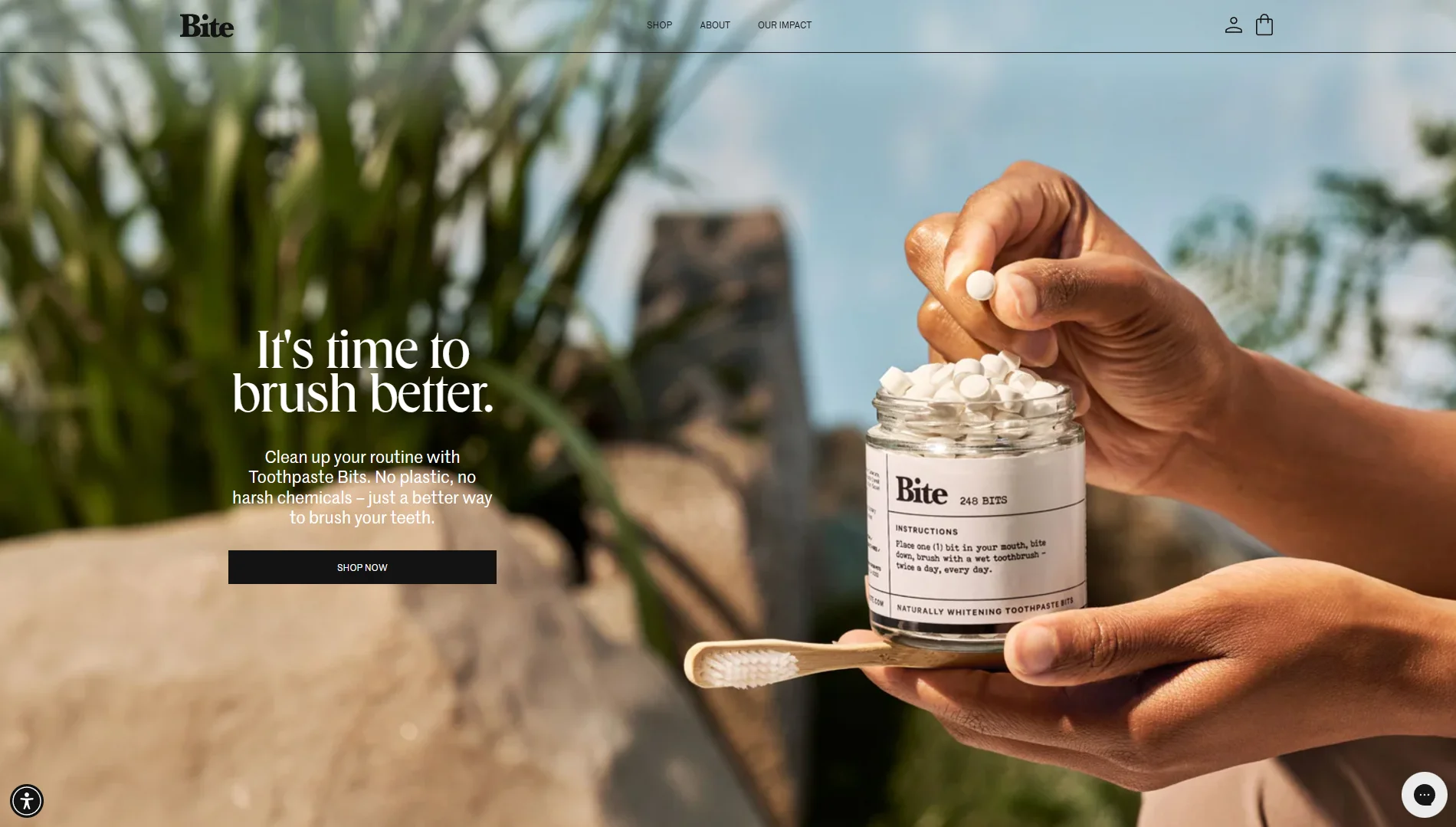
Bite Toothpaste Bits, for example, uses a black CTA button on the product page in contrast to the white background.
On some pages, it puts aquamarine buttons to contrast them with the black background.
Make Sure the Text Is Readable
To make a responsive design for eCommerce, use readable text across your pages.
If users struggle to read the text on your website, they’re likely to lose interest and leave because they can’t easily comprehend the information.
Poor readability can also impact users with visual impairments or other disabilities, showing that your brand doesn’t promote inclusivity and equality.
We suggest you use a font size that is large enough to be easily readable on smaller screens.
A general rule of thumb is to choose a minimum font size of 16px for body text and 12px for smaller text elements like captions or labels.
Use ample whitespace around the text to prevent overcrowding.
Proper spacing between lines of text and around paragraphs can make it easier for users to scan and digest the content.
Also, incorporate standard fonts such as Open Sans and Droid Sans because they’re easy to read even on smaller screens.
Creative fonts like Pacifico are appealing, but they can be hard to read on mobile phones.
More importantly, break up long paragraphs into shorter, more digestible chunks of text.
You can use headings, bullet points, and numbered lists to organize content and make it easier for users to scan the text.
Pay Attention to the Checkout Pages
Checkout page optimization includes minimizing form fields, offering guest checkout options, and providing clear instructions.
US retailer Lowe’s can be an ideal example of guest checkout.
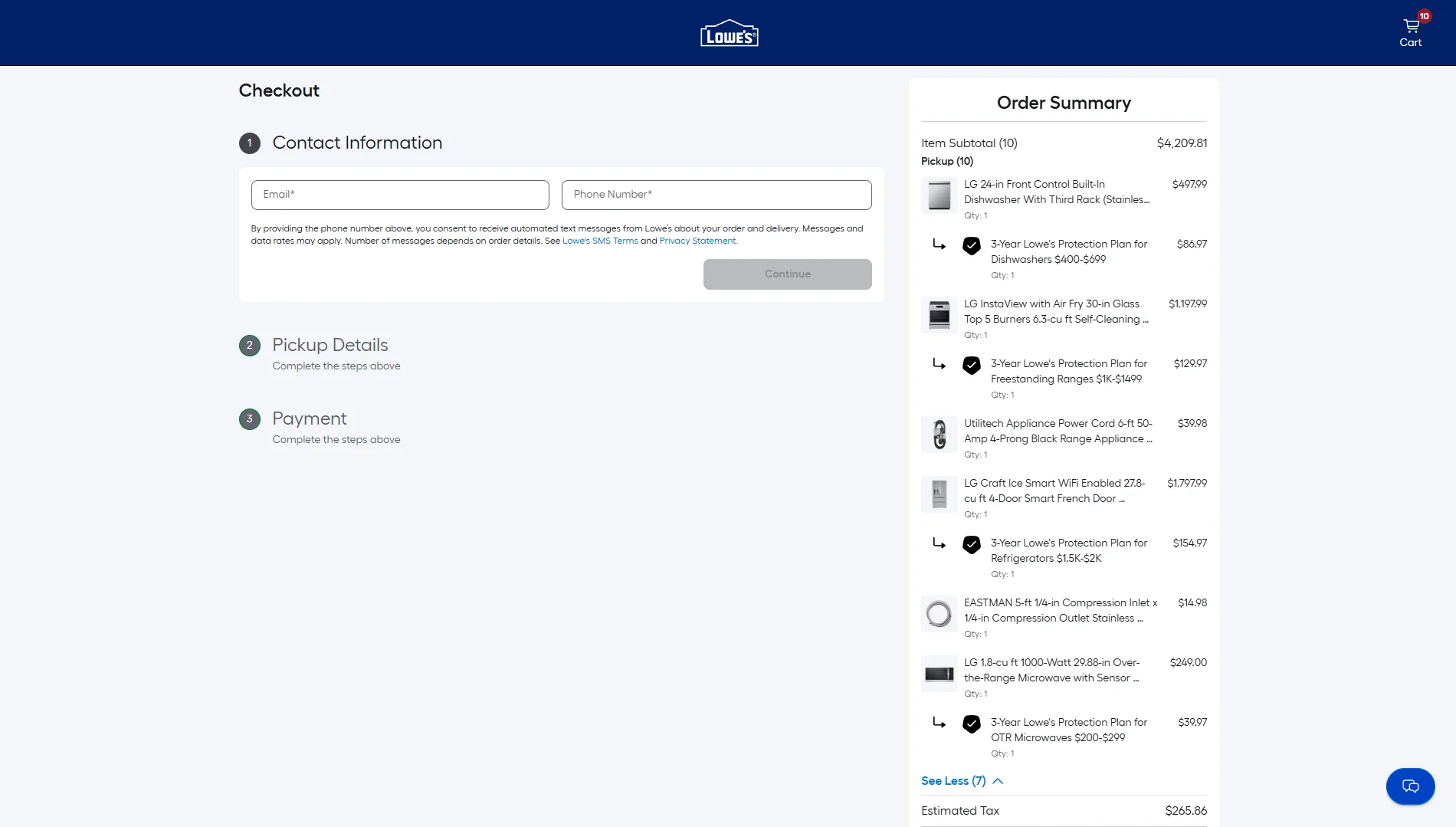
It provides two options: logging in if they already have an account or using guest checkout.
The company also reassures customers that they can create an account later if they want to.
Moreover, don’t forget about the layout.
Mobile devices rely on touchscreens for navigation, so it’s essential to design checkout pages with touch interactions in mind.
Buttons and form fields should be large enough to tap easily, and spacing should be sufficient to prevent accidental taps.
Consider offering a variety of payment options, such as credit/debit cards and digital wallets, to accommodate diverse customer preferences and improve conversion rates.
You can also add automatic redirection to a mobile payment app to further enhance the mobile checkout experience, allowing faster transactions and improving security.
Test Across Devices
Testing across devices involves evaluating the performance and appearance of your website on various mobile devices.
This step aims to have high-quality eCommerce website performance on mobile, as you know which aspects to improve.
Use a diverse range of mobile devices, including smartphones and tablets, representing different operating systems (iOS, Android), screen sizes, resolutions, and browsers.
Consider popular devices in your target audience demographic.
If your resource is limited, copy and paste your eCommerce site or specific page’s link to Google’s Lighthouse.
It’s completely free to use – no subscription fees or premium charges.
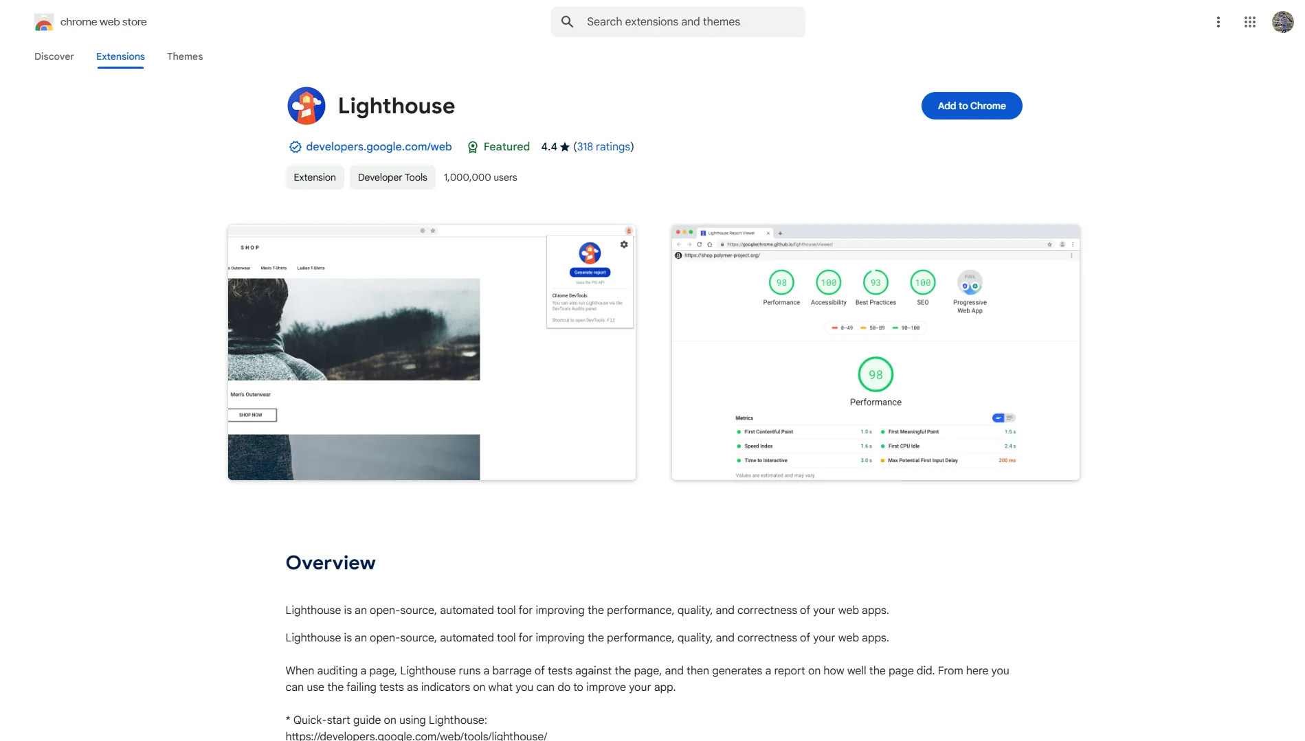
The tool will provide instant feedback on the website’s performance on mobiles and desktops, highlighting any issues or areas for improvement and helping you address them quickly.
Conclusion
Implementing eCommerce website best practices for mobile users is important because they tend to leave a site that doesn’t deliver a good experience.
A seamless experience isn’t only limited to the website’s design but also considers the user’s journey by providing non-intrusive pop-ups and a fast-loading online store.
We hope these mobile eCommerce development tips have helped improve your website performance and increase revenue!
Feel free to contact us if you’re looking for a reliable web development agency to build an eCommerce website.
Our team is dedicated to crafting mobile-friendly online stores that prioritize user experience and conversion optimization.
From development to audit services, our team at Intelivita offers comprehensive solutions to ensure your eCommerce website meets industry standards and delivers exceptional performance.
Contact us and start building your dream online store today!


