Google developed the cross-platform UI toolkit Flutter, which makes it simple to develop, test, and launch stunning apps on any platform or operating system.
The core principles of Flutter are time and cost reduction, uniform user experience, and a consistent interface that works on all platforms.
Knowing how to build a Flutter app is pretty important but knowing how to create an app that is outstanding and presentable is just as important.
In this article, we will be talking about the guidelines for Flutter UI/UX design.
Advantages of using Flutter for your UI/UX
Flutter has become popular because of the advantages it contributes to an effective design process.
Let’s see some of the advantages:
Declarative UI
As opposed to the imperative approach of updating your UI, where you have to specifically state the steps of how the state should be to update the UI properly, Flutter follows the declarative paradigm.
In Flutter, designers and developers can explicitly define the state of how the UI should be while the SDK handles updating the UI based on those conditions.
Reactive programming
Flutter allows users to handle complex data using streams.
This means that your app can remain consistent and has up-to-date data in real-time based on the underlying models.
Flutter’s reactivity makes it simple for users to handle complex UI that reacts to human input and changes data seamlessly.
Rich widget library
Flutter provides pre-built immutable widgets that allow users to define UI.
Some examples include text, Container, Checkbox, etc. These widgets can be combined to create even more complex user interfaces.
Hot reload
Flutter’s hot reload makes for efficient UI implementation for designers and developers as they can always make UI variations quickly and with ease.
One single codebase
Because Flutter is cross-platform, you do not need to manage separate codebases and designs for one product, which might grow apart and have different user interfaces or feel as more changes are being made.
With Flutter, you can quickly get your MVP distributed on different platforms all from one single codebase, and one update cuts across all these platforms.
Check out our article on why you should use Flutter for your MVP.
High performance
Unlike other frameworks that depend on web components to render their UI or depend on the platform rendering machine, Flutter uses SKIA, its own 2D rendering machine.
SKIA is an open-source 2D rendering engine acquired by Google. It is the rendering engine for Chrome and other Google platforms.
Core Principles of Flutter UI/UX Design
User-centered design
User-centered design( UCD) is an iterative, investigative, and sometimes generative method used to understand the user’s needs, wants, and behaviors throughout a design and development process.
Understanding user behaviors, needs, and wants can help designers make informed decisions on the overall layout, navigation, and the overall aesthetics of the UI.
Creating user-centered design ensures that not just a functional app is created but users can also enjoy every application process.
Principles of Material Design
Material design is a self-contained and comprehensive design developed by Google to create consistent and appealing visuals across different platforms.
Flutter’s default design system is the material design.
This allows developers to create consistent designs across their mobile apps.
Bold Typography
- The material design emphasizes large and legible fonts for readability and accessibility.
This makes sure that text is readable across all screen sizes.
- Material design also implements a hierarchy of texts.
That is, there are distinctions between headings and subheadings that help to guide the user’s eyes and create a sense of arrangement.
Vibrant colors
The importance of colors cannot be overemphasized.
It is used to mark very important information, differentiate sections, and even convey certain emotions or themes.
Material design uses primary, secondary, and accent color palettes to maintain visual consistency in user experience.
- Primary color: This is used to signify actions or major elements in the application.
- Secondary color: It could be used for action buttons or background colors.
Material designs emphasize accessibility considerations urging designers to adhere to guidelines that enhance user experience for visually impaired users.
Consistent Iconography
Material design provides a consistent icon library which if used thoughtfully can help guide users and provide visual clues to interact or navigate the application.
These icons are designed to adapt to different screens and provide the best user experience possible.
Guidelines for Effective Flutter UI/UX Design
Maintaining consistency in the appearance of your Flutter application is crucial.
Equal spacing/padding, proper application of colors, accurate utilization of fonts.
You may increase the attractiveness of your Flutter app by following these simple steps.
Some simple guidelines to follow:
Color usage
- Color palette: Try utilizing a primary, secondary, and accent color scheme that complements each other well. For a unified design, apply it all throughout your Flutter application. Using a color palette will strictly keep you from using random colors and improve strategic color usage.
- Color contrast: Use adequate contrast between texts and background colors or containers to ensure readability.
- Color physiology: Every color you use in your app conveys an emotion and as such must understand what best suits the feel of your app.
Typography
Readability: Choose a font that is readable, clear, and legible on all screens.
San-serif like Roboto or Raleway is most regularly used in material design based on its clean and modernized look.
Font weight: Use consistent fontweight like bold, medium, and regular to improve font hierarchy.
Furthermore, use proper hierarchy systems for headings and subheadings by defining a certain font size.
Font style: Use a font style that suits the tone of your overall app.
An app for children or informal purposes may use a quirky text style while a formal app should use more traditional or formal text styles.
Spacing
Consistent spacing: Maintain a consistent space between widgets to maintain a sense of order.
White spaces: Avoid cluttering Flutter widgets together.
Include widgets like SizedBox and specify a height to implement whitespace.
Consistent padding: Use consistent padding around your UI elements to improve orderliness.
Padding stops your widgets from overlapping each other or overflowing.
Screen sizing
It can be difficult to create mobile applications because different industries create devices with different screen sizes for portability.
This means that you have to write apps that will work on any device that your app is installed on, which means that when an app is adopted, it must
adjust to the screen size. You can use MediaQueries or the Flutter package flutter_screenutils to achieve flexibility.
An app that adjusts to the user’s device appropriately enhances the user experience in general.
Layout
Layout structuring is such an important part of the Flutter app development process. Flutter offers a set of amazing widgets to build any layout. See our article on flutter widgets to learn more.
Here are some widgets packed with Flutter for drawing out layouts.
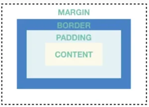
Container: Container widget is a fundamental widget prepacked with Flutter.
This widget allows for adding margin, padding, border radius, and background decorations. Consider it as a box that holds other widgets.
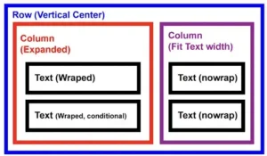
Row and Column: These widgets allow you to arrange widgets horizontally and vertically, respectively.
They are used to create layouts based on a single axis.
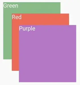
Stack: This layout widget allows you to stack its child widget on each other.
This widget is useful for creating layered layouts. For example, you can have images stacked on each other or stack a blur effect on a container to create effects.
These widgets put together will allow you to create stunning UI and will also impact the user’s experience immensely.
Accessibility
In order to make sure that your apps are accessible and useable by people with a variety of abilities, such as those who have visual, auditory, motor, or cognitive disabilities, accessibility in Flutter UI/UX design, is crucial.
You not only fulfill a moral commitment but also grow your user base and improve user experience overall by putting accessibility first.
Why accessibility
Moral Obligation: Ensuring the accessibility of goods and services is a question of inclusivity and social responsibility.
Being able to access resources is a fundamental right that is protected by international agreements.
A benefit to business: Customers with disabilities, who have little or no options, are among the wider range of consumers drawn to accessible products.
Accessibility Guidelines in Flutter
- Semantic Markup: To help people with vision impairments understand your user interface (UI), define the content and structure of your UI elements using semantics.
- Visual Contrast: In order to guarantee readability for individuals with low vision or color blindness, it is important to maintain an adequate contrast between the text and background colors.
- Keyboard Navigation: To enable users with motor impairments to interact with your app solely through keyboard input, incorporate keyboard navigation. With keyboard shortcuts, make sure every element is focused and easily accessible.
- Alternative Text: For users who are blind or visually impaired, provide alternative text descriptions for pictures and non-text elements.
- Labels: Give users a clear and concise explanation of the features and functionalities of your app by using labels and instructions.
Conclusion
Having a well-tested and functional app is important but if you want a userbase for your application, your Flutter app needs to be inclusive.
You have to consider your user’s needs and prioritize aesthetics and experience overall.
Flutter being a UI toolkit provides you with all basic widgets to create stunning applications to stand out and keep your users happy.
Considering the steps above, Flutter app development might be a bit more tasking than it should be.
If you need the heavy lifting to be done for you, you can reach us to streamline the process.

