

Responsive web development involves building websites that automatically adapt to different screen sizes and devices using flexible grids, fluid images, and media queries. This ensures that users experience consistent design and functionality whether they’re using desktops, tablets, or smartphones.
The best frameworks for responsive development include Bootstrap, Tailwind CSS, Foundation by Zurb, Bulma, and UIkit. These tools simplify layout creation, offer reusable UI components, and integrate easily with front-end workflows.
The main programming languages used are HTML5, CSS3, JavaScript, Sass/SCSS, and TypeScript. Each language plays a role in structuring content, styling responsive elements, or adding interactivity.
To build a responsive website, developers follow a step-by-step process: setting viewport meta tags, using fluid grids, applying media queries, optimizing images, adjusting typography, and testing across devices.
According to Statista (2024), mobile devices account for 59.4% of global website traffic, proving the demand for mobile-first, cross-platform performance. Responsive design directly supports usability, SEO rankings, and long-term scalability.
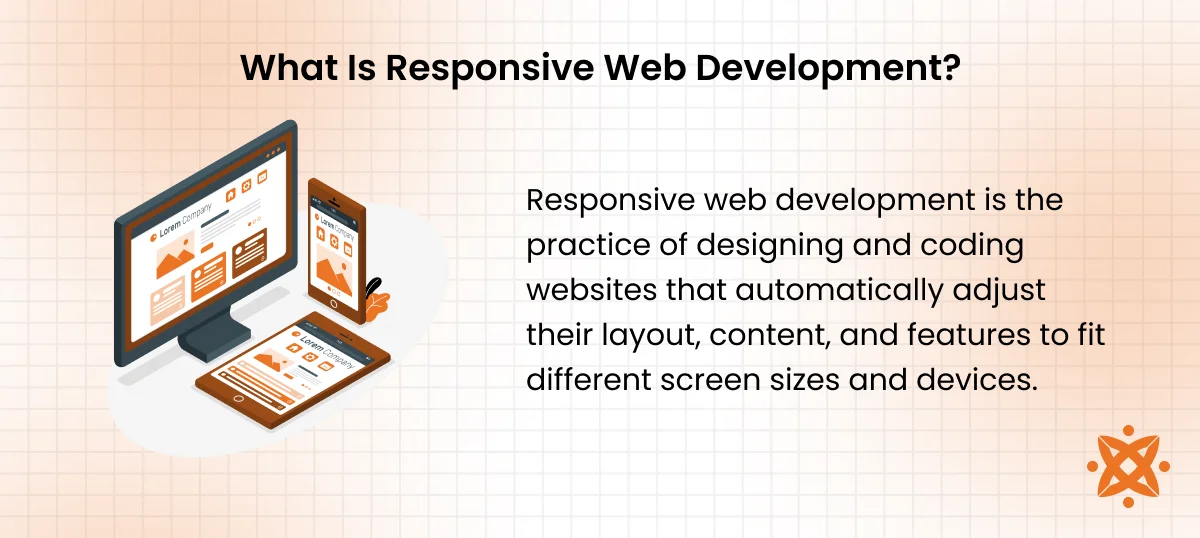
What Is Responsive Web Development?
Responsive web development is the practice of designing and coding websites that automatically adjust their layout, content, and features to fit different screen sizes and devices. This approach uses flexible grids, fluid images, and media queries to adapt the interface dynamically.
Responsive design is important because over 59.4% of global web traffic comes from mobile devices, according to Statista 2024. A mobile-friendly website improves user experience, lowers bounce rates, and increases time on site. Google also prioritises mobile-first indexing, directly impacting your SEO visibility.
The main benefits of a responsive website include faster load times, improved cross-platform compatibility, and easier maintenance. It also supports web accessibility, making your content usable for all users regardless of device or ability.
How Does Mobile-First Design Impact Responsive Development?
Mobile-first design impacts responsive development by starting the design and coding process with the smallest screen in mind, then progressively enhancing the layout for larger devices.
This process ensures your core content and functionality are prioritised for mobile users, which is important because of the widespread use of smartphones. This mobile-first design approach also leads to better performance scores and user satisfaction on mobile devices, which directly influence rankings and engagement.
Who Is a Responsive Web Developer and What Do They Do?
A responsive web developer is a front-end professional who specialises in building websites that adapt to different screen sizes and devices using responsive web design principles.
The job of a responsive web developer involves writing clean, scalable code while implementing features like media queries and CSS frameworks to ensure consistent performance across desktops, tablets, and smartphones.
A responsive web developer focus on optimizing layouts for usability, speed, and web accessibility. They work with designers and back-end developers to align UI with technical functionality. Their work also includes testing with tools that simulate various devices to catch layout issues early.
To become a responsive web developer, one should have a solid foundation in front-end development, including responsive design techniques, cross-browser testing, and frameworks like Bootstrap or Tailwind CSS. A degree in computer science also helps, but hands-on experience, a portfolio of responsive websites, and proficiency in UI/UX principles are more important in hiring decisions.
What Are the Best Frameworks for Responsive Web Development?
The best frameworks for responsive web development are Bootstrap, Tailwind CSS, Foundation by Zurb, Bulma, and UIkit. These tools provide grid systems, pre-styled components, and responsive utilities that help you build scalable, mobile-friendly layouts faster and more efficiently.
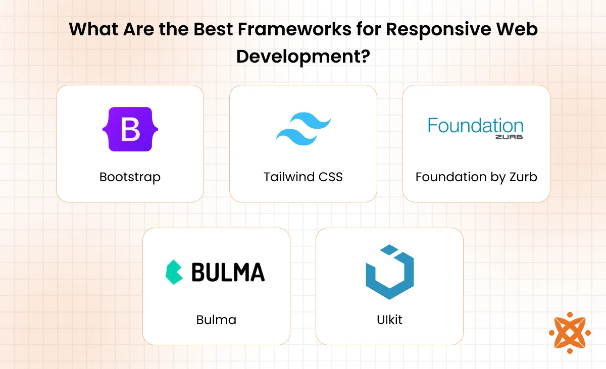
The best frameworks for responsive web development are as follows:
- Bootstrap: Bootstrap is a front-end framework originally released by Twitter in 2011. Bootstrap offers a 12-column grid system, responsive utilities, and prebuilt UI components. It uses HTML, CSS, and JavaScript, making it accessible for most developers. Bootstrap is beginner-friendly, widely documented, and only requires a code editor and browser to get started.
- Tailwind CSS: Tailwind CSS is a utility-first CSS framework that allows you to style elements directly in your markup with predefined classes. It’s written in CSS and integrates easily with JavaScript frameworks. Tailwind is lightweight, highly customizable, and works well with build tools like PostCSS and Webpack.
- Foundation by Zurb: Foundation by Zurb is a responsive front-end framework developed by Zurb, known for its mobile-first approach and robust accessibility features. It uses HTML, Sass, and JavaScript, and includes responsive grids and flexible UI components. It also requires CLI tools for full use, but offers advanced customization.
- Bulma: Bulma is a modern CSS framework based entirely on Flexbox, offering simplicity and ease of use. Bulma is written in pure CSS with no JavaScript dependency, making it ideal for quick setups. You can start it with just a stylesheet link and a browser.
- UIkit: Ulkit is a lightweight and modular front-end framework from YOOtheme that provides a clean design and responsive components. It’s built with HTML, CSS, and JavaScript, and integrates easily with CMS platforms. You can use Ulkit’s CDN for a fast, no-setup start.
What Programming Languages Are Used for Responsive Web Development?
The main programming languages used for responsive web development include HTML5, CSS3, JavaScript, Sass / SCSS, and TypeScript. Each plays a specific role in structuring content, styling layouts, or enabling dynamic interactions. These languages work together to support fluid, adaptable, and mobile-friendly websites.
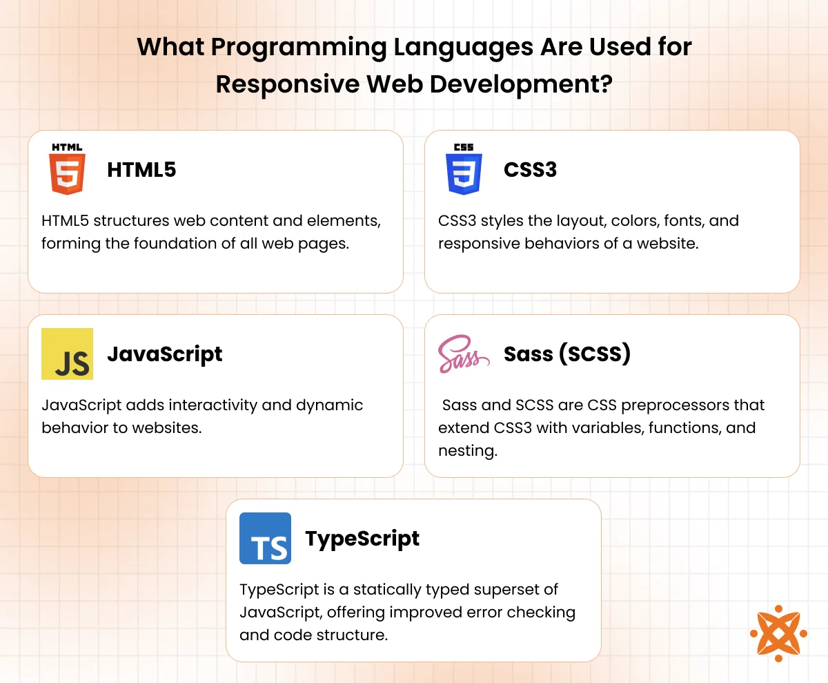
The main programming languages used for responsive web development are:
- HTML5: HTML5 structures web content and elements, forming the foundation of all web pages. It introduces semantic tags, multimedia support, and better form controls. While it ensures compatibility and ease of use, it offers limited control over styling and behavior.
- CSS3: CSS3 styles the layout, colors, fonts, and responsive behaviors of a website. It includes features like media queries, flexbox, and animations that adapt designs to various screen sizes. CSS3 enhances UI flexibility but can become complex when managing large projects.
- JavaScript: JavaScript adds interactivity and dynamic behavior to websites. It handles tasks like responsive menus, sliders, and real-time content updates. Though powerful, JavaScript requires careful optimization to avoid slowing down performance.
- Sass / SCSS: Sass and SCSS are CSS preprocessors that extend CSS3 with variables, functions, and nesting. They simplify managing stylesheets in larger projects and enable cleaner, reusable code. The downside of Sass is the need for compilation tools and a steeper learning curve for beginners.
- TypeScript: TypeScript is a statically typed superset of JavaScript, offering improved error checking and code structure. It supports modern front-end frameworks and enhances the scalability of large responsive projects. TypeScript demands additional setup and familiarity with types, but results in more maintainable code.
How to Build a Responsive Website Step by Step
To build a responsive website step by step involves layout design, media control, and continuous optimisation. It requires a structured approach that prioritises flexibility, consistency, and mobile-first functionality.
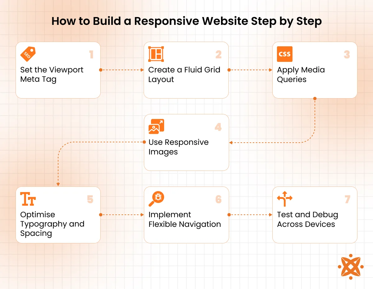
To make a responsive website, follow these essential steps:
Step 1: Set the Viewport Meta Tag
Add the viewport tag in your HTML to define how the site scales on various devices. It sets the page’s visible area to match the screen size. This step ensures consistent rendering across platforms.
Step 2: Create a Fluid Grid Layout
Use percentage-based widths instead of fixed pixel values to build a scalable layout. Frameworks like Bootstrap and CSS Grid make it easier to manage spacing. This approach ensures elements adjust smoothly across screen sizes.
Step 3: Apply Media Queries
Media queries in CSS3 let you assign different styles for different devices. You can target screen widths and orientations to alter layout and visibility. It’s the core method for responsive behavior.
Step 4: Use Responsive Images
Apply srcset and sizes attributes in your image tags to serve optimized images for each device. This reduces bandwidth use and improves page speed. Always compress files for faster loading.
Step 5: Optimise Typography and Spacing
Set font sizes, margins, and padding using relative units like em, rem, or %. This allows content to scale with the screen. It enhances readability on all devices.
Step 6: Implement Flexible Navigation
Design navigation that works on both desktop and mobile, like collapsible menus or hamburger icons. Ensure buttons are large enough to tap easily, prioritise intuitive user flow.
Step 7: Test and Debug Across Devices
Use browser dev tools, online emulators, and physical devices to check responsiveness. Look for layout breaks, overflow, and performance issues. Fix inconsistencies before launch.
What Is the Difference Between Responsive Web Development and Adaptive Web Design?
The main difference between responsive web development and adaptive web design lies in the layout used. Responsive web development uses a single flexible layout that adjusts easily to all screen sizes, while adaptive design uses multiple fixed layouts tailored to specific devices.
Responsive websites rely on media queries, fluid grids, and viewport settings to dynamically reshape content as the screen changes. In contrast, adaptive designs detect the user’s device and load a preset layout that best fits, offering more control but requiring extra development time.
Responsive web development is more future-proof and easier to maintain, while adaptive web design delivers faster performance on targeted devices but lacks flexibility.
How to Choose the Right Responsive Web Developer
To choose the right responsive web developer, look for a developer who understands flexible design systems, accessibility, and cross-device behaviour. Their ability to create a seamless, mobile-first experience across all screen sizes is key.
Follow these tips to choose the right responsive web developer:
- Check Their Portfolio: Look for mobile-friendly websites that load smoothly across different devices. This shows they understand real-world responsiveness, not just desktop design.
- Evaluate Framework Experience: Confirm they’ve built layouts using frameworks like Bootstrap, Tailwind CSS, or Foundation. This proves they manage responsive grids, components, and layout utilities.
- Test Communication Skills: A good developer explains their use of media queries, flexbox, and viewport settings in clear terms. They should keep you updated and align the design with your business goals.
- Assess UI/UX Awareness: Choose someone who designs with user experience in mind, especially on mobile. Responsive website design isn’t just layout; it’s about flow, touch interactions, and accessibility.
- Request Code Samples: Ask to see their HTML5, CSS3, or JavaScript code to evaluate clarity, organization, and reusability. Well-documented code is easier to maintain.
- Check Testing and Debugging Practices: They should test on real devices and browsers, not just emulators. Look for developers who use tools like BrowserStack and Chrome DevTools effectively.
- Understand Their Approach to Performance: They should optimize images, minify files, and reduce HTTP requests. A fast, responsive site performs better and ranks higher.
- Ask for Client Feedback: References help you verify their delivery speed, professionalism, and ability to handle revisions or bugs after launch.
Hiring the right responsive website developer means your website will adapt across devices without performance loss. For an expert web development service, consider Intelivita. With teams in the USA, Canada, India, and Australia, they deliver responsive websites that are mobile-first, speed-optimised, and backed by real-world testing.
What Is the Cost of Responsive Web Development?
The average cost of responsive web development is between $3,000 and $25,000, depending on the complexity, number of pages, and required features. Smaller brochure-style websites with basic responsiveness cost less, while custom platforms with advanced UI/UX, JavaScript interactivity, and third-party integrations fall on the higher end.
Factors that influence the cost of a responsive website include design customisation, use of frameworks like Bootstrap or Tailwind CSS, content migration, testing across devices, and developer location. Ongoing maintenance, SEO optimization, and accessibility compliance also increase the overall budget.
What Are the Best Practices for Responsive Web Development?
The best practices for responsive web development focus on using fluid layouts, defining breakpoints by content needs, optimizing images and typography, testing on real devices, and maintaining accessibility. Following these methods ensures your website performs well across devices, loads faster, and adapts to future tech changes.
Below are the best practices for responsive web development:
- Start with Mobile-First Design: Design for smaller screens first and scale up. This keeps your layout lean and ensures vital content is always visible.
- Use Fluid Grid Systems: Structure your layout using percentages and relative units. This allows elements to resize based on the screen width.
- Define Breakpoints by Content Needs: Avoid designing for fixed devices—use breakpoints where your layout starts to break. This creates more future-proof interfaces.
- Optimize Images for All Devices: Use modern formats like WebP and apply srcset and sizes attributes. Compress all assets to reduce load time and data usage.
- Use Relative Units for Typography: Size text, margins, and padding with em, rem, or % units. These relative units ensure readability and consistency across devices.
- Test on Real Devices and Browsers: Use tools like BrowserStack or actual smartphones and tablets to catch layout issues. Emulators alone won’t see all edge cases.
What Are the Common Challenges in Responsive Web Development?
The most common challenges in responsive web development include inconsistent browser behavior, device diversity, performance on mobile, navigation complexity, and third-party compatibility. These challenges make it harder to maintain consistency and usability across all screen sizes.
Below are the common challenges in responsive web development:
- Inconsistent Browser Rendering: Different browsers handle CSS and layout rules differently, causing design inconsistencies. Developers must run cross-browser testing to catch these issues.
- Device Diversity: With hundreds of screen sizes and resolutions available, designing a universally consistent experience becomes complex. Flexible layouts help, but edge cases still require manual adjustments.
- Performance on Mobile Devices: Large stylesheets, unoptimized images, and heavy JavaScript reduce load speed on mobile networks. Optimizing assets and minimizing scripts are essential for speed.
- Navigation Complexity: Menus and UI components that work on desktops don’t always translate to mobile. Designers must rebuild navigation for smaller screens without compromising usability.
- Layout Breakpoints: Adding breakpoints where layouts shift can lead to visual bugs and misalignment. Each breakpoint must be tested thoroughly to avoid disrupting content flow.
- Touch vs. Mouse Interactions: Hover-based elements don’t work on touchscreens, requiring alternate designs. Developers must account for both touch and click behavior.
- Third-Party Component Issues: Some plugins and embeds aren’t responsive by default. Manual adjustments or alternatives are needed to integrate them smoothly.
What Are the Trends in Responsive Web Development?
The top trends in responsive web development include mobile-first strategy, container-based layout systems, responsive typography, accessibility-first design, and dark mode support. These trends focus on building faster, more adaptable websites that offer consistent experiences across all devices.
Below are the trends in responsive web development:
- Mobile-First Design: Developers start with the smallest screen size and scale up, ensuring performance and content clarity from the outset.
- CSS Grid and Flexbox Layouts: These layout models allow for more precise and flexible design structures without relying on heavy frameworks.
- Responsive Typography: Font sizes and line spacing now scale dynamically using viewport units, improving readability on all screen sizes.
- Dark Mode Support: Websites now support both light and dark themes using CSS media queries like prefers-color-scheme, enhancing user comfort.
- Variable Fonts: These scalable font files reduce load times while offering design flexibility across breakpoints and screen sizes.
- Progressive Web Apps (PWAs): Sites are increasingly built to function like apps with offline support, adaptive interfaces, and quick responsiveness.
What Are Media Queries in Responsive Web Design?
Media queries in responsive web design are CSS rules that apply different styles based on screen characteristics like width, height, resolution, or device type. They allow you to adapt your layout, fonts, and elements at specific breakpoints, enabling responsive behavior without changing the HTML. Media queries are the foundation of fluid design and are essential for building sites that function properly across all devices.
What Layout Techniques Are Best for Building Responsive Sites?
The best layout techniques for building responsive sites include CSS Grid, Flexbox, and fluid layouts using percentage-based widths. CSS Grid offers precise control over rows and columns, making it ideal for complex, scalable structures.
Flexbox is more suited for linear, one-dimensional layouts like navigation bars or stacked elements. These techniques work together with media queries to create interfaces that adjust seamlessly across all screen sizes.
What Is the Viewport Meta Tag and Why Is It Important for Responsive Design?
The viewport meta tag defines how a web page is displayed on different screen sizes by controlling the visible area and scaling. It tells the browser to match the screen’s width, allowing media queries, flexible layouts, and fluid images to work as intended. Without this tag, mobile devices default to rendering pages as if they were on desktops, breaking responsive behavior.
What ARIA Practices Support Responsive Interfaces?
The ARIA practices that support responsive interfaces include aria-hidden, aria-expanded, and aria-label. They help screen readers interpret dynamic or adaptive content correctly. These attributes ensure that elements shown or hidden based on screen size or interaction remain accessible and understandable to users relying on assistive technologies.
What CSS Units Work Best for Responsive Web Design?
The best CSS units for responsive web design are relative units like em, rem, %, vw, and vh. These units scale based on the parent element, root font size, or viewport dimensions, allowing for flexible spacing, fonts, and layout behavior. Unlike fixed px values, relative units adapt naturally across different screens, supporting a consistent and fluid design.
What Are the Best Image Formats for Responsive Web Design?
The best image formats for responsive web design are WebP, AVIF, and SVG. WebP and AVIF offer high compression with minimal quality loss, which reduces load times on mobile networks. SVG is ideal for logos and icons because it scales without losing clarity. These formats support responsive features like srcset and help maintain performance across devices.
What Are the Key Performance Metrics for Responsive Web Design?
The key performance metrics for responsive web design include First Contentful Paint (FCP), Largest Contentful Paint (LCP), Cumulative Layout Shift (CLS), and Time to Interactive (TTI).
These metrics measure how quickly your content loads, how stable the layout is during rendering, and when users can begin interacting. Tracking these ensures your site performs well across devices and improves both user experience and SEO rankings.
What Are the Best Testing Tools for Responsive Web Design?
The best testing tools for responsive web design include Chrome DevTools, BrowserStack, Responsively App, and LambdaTest. Chrome DevTools lets you simulate multiple screen sizes directly in the browser.
BrowserStack and LambdaTest offer cloud-based real-device testing for cross-platform accuracy. Responsively App is a developer-focused tool that previews multiple device views side by side for efficient debugging.


