

Mobile web development focuses on building websites that are optimized for smartphones and tablets, ensuring they load fast, adapt to smaller screens, and offer a smooth user experience (UX). It involves responsive design, efficient navigation, and touch-friendly layouts that perform well on all mobile browsers.
According to Statista, mobile devices accounted for 58.67% of global website traffic as of 2024, and Google’s mobile-first indexing makes mobile usability critical for visibility.
The best frameworks and tools for mobile web development include React Native, Flutter, Ionic, and front-end frameworks like Bootstrap and Tailwind CSS. These tools support cross-platform development and help developers deliver native-like functionality through a WebView or browser.
Programming languages used in mobile web development include HTML5, CSS3, JavaScript, TypeScript, and Dart. These technologies offer interactive, scalable, and mobile-optimized web experiences.
To develop a mobile-friendly website, start with a mobile-first layout using responsive design, flexible grids, and the viewport meta tag. Then focus on mobile optimization, compress images, minimize scripts, and test across devices using tools like Google’s Lighthouse.
What Is Mobile Web Development?
Mobile web development is the process of designing and building websites specifically optimized for smartphones and tablets. It focuses on creating responsive layouts, fast load times, and intuitive user interfaces that work smoothly across various screen sizes and mobile browsers.

Mobile web development is important because over 55% of global web traffic now comes from mobile devices, and U.S. users alone spend an average of 4 hours per day on mobile internet, according to Statista. If your site isn’t mobile-friendly, you risk losing visibility, engagement, and revenue, especially since Google’s algorithm now prioritizes mobile usability in its search rankings.
Use cases for mobile web development include e-commerce sites, service booking platforms, local business websites, news portals, and any platform where mobile traffic makes up a significant share.
In today’s digital strategy, mobile web development plays a central role; it’s no longer optional but a requirement for businesses that want to stay relevant, competitive, and accessible.
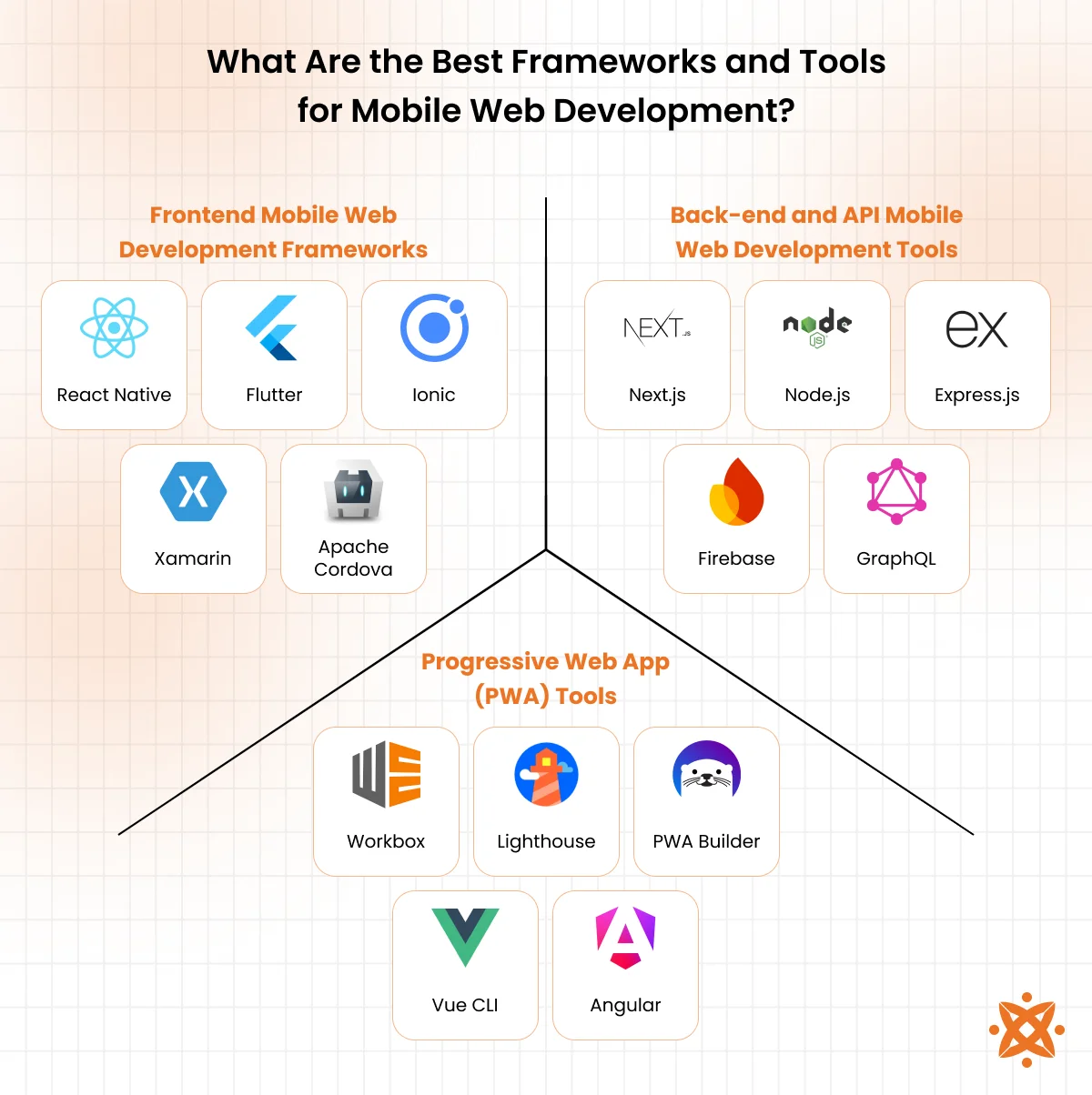
What Are the Best Frameworks and Tools for Mobile Web Development?
The best frameworks and tools for mobile web development include React Native, Flutter, Ionic, Bootstrap, and PWAs (Progressive Web Apps). These tools help developers build responsive, mobile-optimized web applications that load fast, adapt to different devices and offer app-like experiences directly in the browser.
The following are the best frameworks and tools for mobile web:
Frontend Mobile Web Development Frameworks
Here are some of the top frameworks used in mobile web development, each offering a unique approach to building responsive, mobile-friendly experiences:
- React Native: Developed by Facebook in 2015, React Native allows you to build mobile apps using JavaScript and React. It’s widely adopted, easy for React developers to pick up, and integrates with tools like Expo and VSCode. React native provides near-native performance but requires native code for advanced features.
- Flutter: Released by Google in 2017, Flutter uses the Dart programming language to build high-performance, cross-platform mobile apps. It comes with its rich widget library and works well with tools like Android Studio and Visual Studio Code. Flutter is powerful and fast, but has a steeper learning curve due to Dart.
- Ionic: Launched in 2013, Ionic is built on top of web technologies like HTML, CSS, and JavaScript and works well with Angular, React, or Vue. It uses a Capacitor for native functionality and pairs well with any modern code editor. It’s easy to learn for web developers, but it does not match native performance in complex apps.
- Xamarin: Owned by Microsoft and released in 2011, Xamarin allows developers to create apps using C# and .NET. It’s integrated with Visual Studio and offers native-like performance, especially on Windows platforms. It’s powerful but more suited to teams already working in the Microsoft ecosystem.
- Apache Cordova: Originally created by Nitobi and later acquired by Adobe, Cordova uses HTML, CSS, and JavaScript to build mobile apps that run in a WebView. It’s easy to start with, especially for web developers, but lacks the performance and modern tooling of newer frameworks like Flutter or React Native.
These tools are essential for styling and managing front-end web development code efficiently
Frontend Mobile Web Development Tools
Frontend mobile web development tools are essential for styling and managing mobile-first front-end code efficiently. Here’s a quick look at the most widely used:
- Bootstrap: Developed by Twitter in 2011, Bootstrap is a popular CSS framework that helps developers build responsive, mobile-first websites quickly using prebuilt UI components. It’s easy to use and ideal for prototyping and launching fast.
- Tailwind CSS: Released in 2017, Tailwind CSS is a utility-first CSS framework that lets you build custom designs directly in your markup. It’s highly flexible and modern but has a learning curve if you’re coming from traditional CSS.
- Foundation: Created by Zurb, Foundation is a responsive front-end framework similar to Bootstrap but geared more toward advanced layouts and accessibility. It’s slightly more complex to use but powerful for large-scale projects.
- Webpack: Webpack is a JavaScript module bundler introduced in 2012 that compiles and bundles your front-end assets (HTML, CSS, JS) for efficient delivery. It’s very powerful but can be complex to configure, especially for beginners.
- PostCSS: PostCSS is a tool that transforms your CSS with JavaScript plugins, enabling things like auto prefixing, nesting, and custom variables. It’s lightweight, flexible, and integrates well with build tools like Webpack and Vite.
Back-end and API Mobile Web Development Tools
Back-end and API mobile web development tools handle data processing, server-side logic, and communication between the frontend and backend. It is key for building functional mobile web applications. Examples of back-end and API mobile web development tools include:
- Next.js with Node.js/Express or APIs: Next.js is a React-based framework by Vercel, often used with Node.js and Express.js to build full-stack web applications. It supports server-side rendering and API routes, making it ideal for mobile-friendly apps that need dynamic content. It’s developer-friendly, especially for those already using React.
- Node.js: Released in 2009, Node.js is a JavaScript runtime built on Chrome’s V8 engine that allows you to run JavaScript on the server. It’s lightweight, fast, and ideal for real-time applications. It’s easy to use for JavaScript developers and integrates well with front-end tools.
- Express.js: A minimal and flexible web application framework for Node.js, Express.js helps developers create APIs and server logic efficiently. Launched in 2010, it’s widely used in full-stack development and pairs well with MongoDB or any database. Its simple syntax makes it easy to learn.
- Firebase: Developed by Google, Firebase is a backend-as-a-service (BaaS) platform that offers authentication, real-time databases, cloud storage, and hosting. It requires no traditional server setup and is easy to use for fast deployment and scaling. Ideal for small apps and MVPs but limited in customization.
- GraphQL: Created by Facebook in 2015, GraphQL is a query language for APIs that allows clients to request only the data they need. It simplifies complex data fetching and improves performance on mobile networks. While powerful, it requires a learning curve and setup compared to RESTful APIs.
Progressive Web App (PWA) Tools
Progressive web app tools help developers turn mobile websites into Progressive Web Apps. These are web applications that behave like native mobile apps, offering offline access, push notifications, and fast loading.
Examples of progressive web app tools include the following:
- Workbox: Developed by Google, Workbox is a set of JavaScript libraries that simplifies the process of adding service workers to your web app. It automates caching and offline support, making PWAs more reliable and efficient. It’s easy to integrate into modern build setups like Webpack.
- Lighthouse: Lighthouse is an open-source tool by Google that audits web pages for performance, accessibility, SEO, and PWA readiness. It’s built into Chrome DevTools and gives clear, actionable reports. It’s beginner-friendly and essential for improving mobile web performance.
- PWA Builder: Created by Microsoft, PWA Builder helps developers quickly turn a website into a Progressive Web App by generating the necessary files and configurations. It offers a step-by-step interface and supports multiple platforms. It’s perfect for beginners or small teams without deep PWA experience.
- Vue CLI PWA Plugin: This plugin for Vue CLI makes it easy to add PWA support to any Vue.js project. It configures service workers, caching strategies, and web manifest files automatically. It’s simple for Vue developers and requires minimal setup.
- Angular Service Worker: Built into Angular as part of its official service worker package, this tool allows Angular apps to function as PWAs with features like offline caching and background sync. It integrates directly with the Angular CLI and requires little manual configuration. Ideal for teams already using Angular.
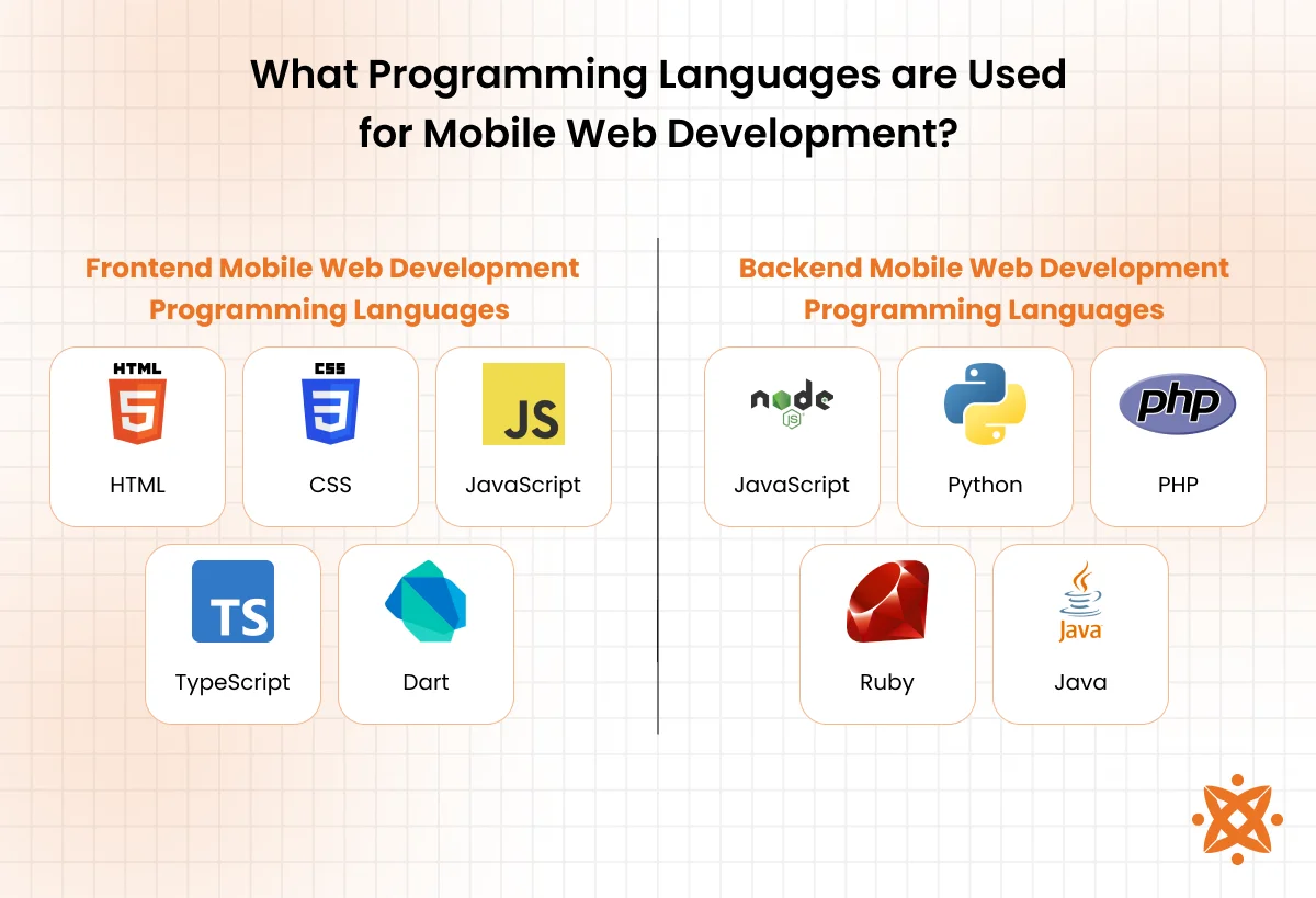
What Programming Languages are Used for Mobile Web Development?
The main programming languages used for mobile web development include HTML, CSS, JavaScript, TypeScript, and Dart. These languages work together to create responsive layouts, interactive features, and cross-platform functionality for mobile browsers.
The following are programming languages used for mobile web:
Frontend Mobile Web Development Programming Languages
Frontend mobile web development programming languages you will use when building mobile-friendly websites include the following:
- HTML: HTML (HyperText Markup Language) is the foundation of every web page. It lets you define the structure, like headings, text, buttons, and images, so your content appears correctly on mobile screens. HTML is easy to learn and essential, but it can’t style or animate anything on its own.
- CSS: CSS (Cascading Style Sheets) controls how your website looks. It handles colors, spacing, fonts, and layout adjustments to make your site responsive and mobile-friendly. While powerful, large CSS files get messy unless organized with tools like SASS or frameworks like Tailwind.
- JavaScript: JavaScript brings your site to life by adding interactivity—like dropdowns, swipe actions, and animations. It runs right in the browser and works well across all mobile devices. However, without careful optimization, JavaScript can slow down performance or cause bugs.
- TypeScript: TypeScript is a typed version of JavaScript that helps catch errors before they break your mobile site. It makes large-scale front-end projects more maintainable and easier to debug. The learning curve is a bit steeper than JavaScript, but the benefits show up quickly as your codebase grows.
Backend Mobile Web Development Programming Languages
These backend mobile web development programming languages power the logic behind your mobile web applications, handling data, processing requests, and connecting to databases or APIs.
Examples of backend mobile web development programming languages include:
- JavaScript: On the server side, JavaScript runs through Node.js, allowing you to use a single language across both the front and back end. It’s fast, event-driven, and ideal for mobile apps needing real-time features. The downside of JavaScript is that it can get complex to manage without a solid structure or framework like Express.
- Python: Python is known for its readability and simplicity, making it great for building scalable backends using frameworks like Django or Flask. Python is especially useful for mobile web apps that require data processing or API integration. However, it’s not as fast as some compiled languages.
- PHP: PHP is a widely used server-side scripting language, great for handling forms, sessions, and dynamic content. It works well with MySQL and powers platforms like WordPress. While PHP is easy to start with, older PHP codebases can be hard to maintain without modern frameworks like Laravel.
- Ruby: Ruby, especially when used with Ruby on Rails, allows for rapid backend development with clean, readable code. It’s perfect for startups and MVPs that need to launch quickly. That said, performance and scalability can be a concern for very large apps.
- Java: Java is a robust, object-oriented language often used for enterprise-grade backends. It’s known for reliability, cross-platform support, and strong security. The tradeoff is that development in Java tends to be more verbose and requires more setup.
How to Create a Mobile-Friendly Website?
To create a mobile-friendly website, design with a mobile-first approach, utilizing responsive layouts, flexible images, and readable fonts that adapt to any screen size. You should also optimize load times by compressing assets, minimizing code, and using modern frameworks like Bootstrap or Tailwind CSS for better mobile performance.
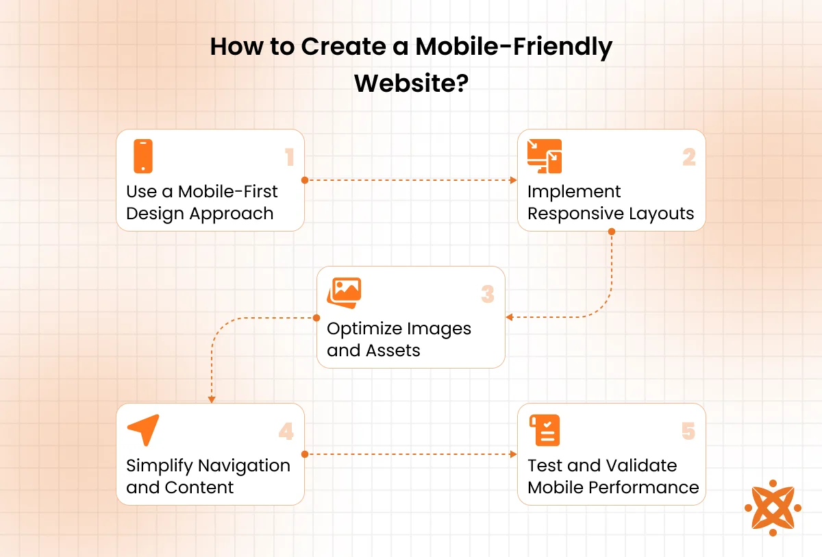
Steps to create a mobile-friendly website include the following:
1. Use a Mobile-First Design Approach
Start by designing for the smallest screen first, then scale up to tablets and desktops. This ensures that the important content and functions are prioritized for mobile users. You’ll avoid clutter and make the layout clean and efficient. Tools like Figma or Adobe XD can help you prototype responsive designs.
2. Implement Responsive Layouts
Use CSS media queries and flexible grid systems to make your layout adjust to different screen sizes. Frameworks like Bootstrap and Tailwind CSS simplify this with prebuilt responsive classes. This step is critical for maintaining a consistent user experience across devices. Test your design on both Android and iOS browsers to confirm consistency.
3. Optimize Images and Assets
Large images and uncompressed assets slow down your site on mobile networks. Use tools like TinyPNG or ImageOptim to reduce file sizes and modern formats like WebP. Lazy loading techniques also improve performance by only loading images when needed. This helps reduce bounce rates and improve SEO scores.
4. Simplify Navigation and Content
Mobile users expect fast access to information, so avoid complex menus and lengthy text. Use dropdowns, hamburger menus, and collapsible sections to keep things clean. Break up content into small sections with clear headings and calls to action. Always ensure the buttons are large enough to tap comfortably.
5. Test and Validate Mobile Performance
Use tools like Google Lighthouse or PageSpeed Insights to test your site’s speed, responsiveness, and mobile usability. Check for touch targets, font legibility, and layout shifts. Validate your code and monitor loading speed on real devices or emulators. Regular testing helps catch issues before they affect user experience.
What are Progressive Web Apps?
Progressive Web Apps (PWAs) are web applications that behave like native mobile apps while running entirely in a web browser. They are installed on a user’s device, work offline, send push notifications, and load quickly, even on unreliable networks.
PWAs use features like service workers, web manifests, and caching to deliver app-like experiences without needing to go through an app store. They’re fast, secure, responsive, and cost-effective to build and maintain compared to native apps.
By combining the reach of the web with the performance of a mobile app, PWAs enhance the mobile experience through faster load times, smoother navigation, and the ability to access content even without an internet connection. This trait makes them ideal for improving user engagement and retention.
What Is the Difference Between Mobile Web Development and Mobile App Development?
The main difference between mobile web development and mobile app development is that mobile web development creates browser-based websites accessible through the internet, while mobile app development builds software specifically designed to run on iOS or Android devices. Mobile websites run on any device with a browser and require no installation, whereas mobile apps must be downloaded from app stores and installed locally.
What Is the Difference Between Mobile Web Development and Native App Development?
The main difference between mobile web development and native app development is that mobile web development builds responsive websites accessed through browsers, while native app development creates platform-specific apps that are installed directly on mobile devices.
Native apps are built using platform-specific languages like Swift for iOS or Kotlin for Android, offering deeper integration with device hardware. Mobile websites, on the other hand, are easier to update, accessible across all devices, and more cost-effective to build and maintain.
What Is the Difference Between Mobile Web Development and Web Development?
The main difference between mobile web development and web development is that mobile web development focuses specifically on optimizing websites for mobile devices, while general web development covers all devices, including desktops, tablets, and mobile. Mobile web development prioritizes responsive layouts, touch-friendly interfaces, and performance on smaller screens and slower networks.
In contrast, standard web development does not always account for mobile limitations unless a mobile-first strategy is used. Mobile development requires stricter performance tuning and UX adjustments to meet mobile user expectations and Google’s mobile-first indexing standards.
How To Optimize Mobile Web Performance?
To optimize mobile web performance, you should minimize file sizes, compress images, reduce JavaScript usage, and enable lazy loading for media and third-party scripts. Using tools like Lighthouse, WebPageTest, and CDN services helps you analyze speed and ensure fast load times across all mobile networks.
Here are the key steps to optimize mobile web performance:
- Compress images and media: Use modern formats like WebP and tools like TinyPNG to reduce file sizes without losing quality. This helps pages load faster on slower mobile networks.
- Minify and bundle code: Reduce the size of your HTML, CSS, and JavaScript files by removing unnecessary characters and combining scripts where possible. Tools like Webpack and Terser make this process easy.
- Enable lazy loading: Load images, videos, and content only when they’re needed, instead of all at once. This significantly improves initial load time.
- Use a content delivery network (CDN): CDNs like Cloudflare or Fastly store your site closer to users geographically, reducing latency and speeding up delivery.
- Reduce JavaScript execution: Limit the use of heavy JavaScript frameworks and remove unused scripts. This reduces processing time and prevents lags on lower-end devices.
- Optimize server response time: Use caching, fast hosting, and database optimization to serve your site quickly. Google recommends a server response time of under 200ms.
- Use performance monitoring tools: Regularly audit your site using Lighthouse, PageSpeed Insights, or WebPageTest to find and fix performance bottlenecks.
How To Choose the Right Mobile Web Development Company?
To choose the right mobile web development company, look for a team with proven experience in responsive design, Progressive Web Apps, and cross-device performance optimization. Check their portfolio, client reviews, and ability to deliver mobile-first solutions using modern frameworks and tools.
Here are essential tips for choosing a mobile web development agency:
- Check their mobile-first experience: Ensure the agency specializes in building responsive, touch-optimized websites for smartphones and tablets.
- Review their portfolio and case studies: Look for examples of Progressive Web Apps, e-commerce, or custom mobile web platforms they’ve built.
- Ask about their tech stack: They should be comfortable with modern frameworks like React, Flutter, or Vue, and use tools like Lighthouse and WebPageTest.
- Evaluate communication and project management: A reliable agency should provide regular updates, use collaboration tools, and meet deadlines consistently.
- Look for post-launch support: Ensure they offer maintenance, performance monitoring, and updates even after your site goes live.
Choosing the right team can make or break your mobile web success. Need a trusted partner? Consider Intelivita for a mobile web development company. They deliver high-performance, mobile-optimized websites using cutting-edge frameworks, provide full support from concept to launch, and have a proven track record working with businesses across industries.
What Is the Cost of Mobile Web Development?
The average cost of mobile web development is between $5,000 and $30,000, depending on the complexity, design requirements, and features of the website.
Basic mobile websites with a few static pages and standard responsiveness tend to fall on the lower end, while advanced platforms like Progressive Web Apps (PWAs), e-commerce solutions, or custom integrations push the pricing much higher.
Factors that influence mobile web development cost include the number of pages, design complexity, whether it’s built from scratch or using templates, integration with APIs or back-end systems, and the hourly rate of the development team or agency. Ongoing costs such as mobile performance optimization, SEO, testing, and post-launch support also contribute to the total investment.
What Are the Best Practices for Mobile Web Development?
The best practices for mobile web development include using a mobile-first design approach, optimizing load speed, and ensuring cross-device compatibility. You should also focus on touch-friendly navigation, use scalable images, and follow accessibility standards to deliver a consistent and user-friendly mobile experience.
Here are the top best practices to follow when building mobile-friendly websites:
- Design mobile-first: Start your design process with the smallest screen in mind and scale up. This ensures core features and content remain accessible on all devices.
- Use responsive layouts: Implement flexible grids, media queries, and percentage-based widths to adapt your design to different screen sizes.
- Optimize performance: Minimize CSS and JavaScript, compress images, and use lazy loading to improve page load times on mobile networks.
- Make navigation touch-friendly: Use large, tappable buttons and avoid hover-only menus to improve usability on touchscreens.
- Use scalable images and fonts: Ensure visuals and text adjust cleanly across different resolutions to maintain readability and visual clarity.
- Prioritize accessibility: Use semantic HTML, proper contrast ratios, and alt text to make your site usable for all visitors, including those with disabilities.
- Test on real devices: Don’t rely on emulators alone—test your site on actual phones and tablets to ensure consistent functionality.
- Implement mobile SEO best practices: Optimize for Core Web Vitals, use structured data, and ensure fast load times to boost visibility in mobile search results.
- Leverage service workers: Use service workers for caching, offline support, and improved load speed, especially for Progressive Web Apps.
- Keep it simple: Reduce unnecessary features or animations that may slow down performance or distract users from the main goal of the site.
What Are the Trends in Mobile Web Development?
The trends in mobile web development are Progressive Web Apps (PWAs), mobile-first frameworks like Flutter and React Native, and AI-powered performance tools. There’s also a growing focus on Core Web Vitals, motion UI, voice search optimization, and integrating features like offline access and push notifications for a more app-like experience.
The top trends in mobile web development include:
- Progressive Web Apps (PWAs): PWAs offer native app-like experiences in the browser, with features like offline access, push notifications, and fast loading, even on slow networks.
- Mobile-First Frameworks: Tools like Flutter, React Native, and Ionic are being used not only for apps but also for building mobile-optimized web experiences using shared codebases.
- AI-Powered Development Tools: AI tools like GitHub Copilot and automated testing systems are speeding up front-end and back-end workflows while improving code quality.
- Motion UI and Microinteractions: Subtle animations and feedback cues enhance the user experience by making interfaces feel smoother and more responsive.
- Voice Search Optimization: As mobile voice assistants grow in popularity, developers are structuring content and SEO to support voice-based queries and natural language.
- Core Web Vitals Focus: Google’s mobile-first indexing and ranking heavily weigh metrics like load speed, interactivity, and visual stability, pushing developers to optimize mobile performance.
- Dark Mode and Theming: Users expect light/dark mode options, and more sites are adopting dynamic theming that responds to device settings.
How Does Mobile SEO Impact Visibility and User Experience?
Mobile SEO directly impacts visibility and user experience by influencing how easily users find your site and how well they engage with it once they do. Fast load times are critical; Google’s Core Web Vitals and mobile-first indexing prioritize sites that load quickly and run smoothly on smartphones.
Structured data helps search engines understand your content, enabling rich results like FAQs, reviews, and local listings, while AMP (Accelerated Mobile Pages) boosts performance for content-heavy pages.
Using mobile-friendly testing tools like Google’s Mobile-Friendly Test or Lighthouse helps you identify and fix issues that could hurt your rankings or frustrate users.


