
Android UI design is the structured creation of interfaces for Android applications that are responsive, accessible, and device-adaptive. With over 3.5 million apps on the Google Play Store in 2025, interface quality directly impacts retention and engagement.
The complexity arises from platform fragmentation. Developers must implement layout tools such as ConstraintLayout and Jetpack Compose and use density-independent pixels (dp) to maintain consistent rendering across varied screen sizes.
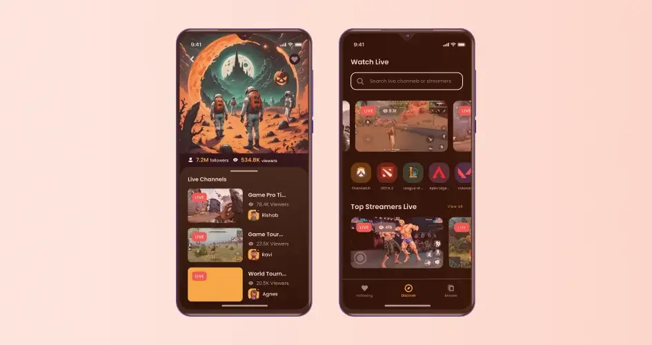
Android UI consists of three element types: Input Controls (buttons, text fields), Containers (RecyclerView, CardView), and Navigation Components (bottom navigation, navigation drawer).
Don Norman states: “Good design is actually a lot harder to notice than poor design…” Android interfaces must remain functional without drawing attention to their structure.
To increase UI efficiency, use Android Studio’s Layout Inspector, conduct real device testing, and apply WCAG-compliant accessibility audits.
1. Follow the Material Design Guidelines
Material Design is Google’s comprehensive guide containing best practices for UI design for Android, iOS, Flutter, and the web.
The guide covers important aspects, such as:
- Layout
- Typography
- Color Schemes
- Iconography
- Motion
- Animation
By following these Android UI design principles from Google, designers can create UI that feels native to the platform while offering a modern and visually appealing experience.
Many users are also accustomed to Material Design’s visual language and interaction patterns.
Therefore, adhering to the guidelines will help designers meet users’ expectations and reduce their learning curve.
Besides guidelines, Material Design has adaptable material components to support your UI design process, helping you create beautiful digital products quickly.
Don’t worry, these pre-built elements let designers adapt them to suit their app’s branding, esthetic preferences, and unique use cases, allowing for creativity and customization while still maintaining consistency.
Components in Material Design are:
- Display. Organize content using cards, lists or vertical indexes, and sheets.
- Navigation. Let users move through the application using components such as tabs and navigation drawers or burger icons.
- Actions. Allow users to perform tasks with components like a floating action button.
- Input. Enable users to input information or make selections using selection controls, chips, and text fields.
- Communication. Alert users to important information or messages using components like snackbars, banners, and dialogs.
2. Pay Attention to Color, Typography, and Imagery
Effective use of color, typography, and imagery plays a crucial role in engaging UI design for an Android app.
Color
To start deciding colors, you need to understand themes. A theme helps apply a consistent tone to your app.
It specifies:
- The darkness of the surfaces
- Shadow level
- Appropriate opacity of ink elements
For consistency, light and dark themes are available to choose from.
After that, choose a color scheme that matches your brand colors.
Referring to the Material Design principles, designers are recommended to focus on Bold and Vibrant colors.
Consider using the Color Tool to create and apply palettes to the user interface while ensuring accessibility of the color combination.
A good tip is to include darker and lighter variations for the primary and secondary colors.
Typography
For Android, Roboto and Noto are the standard typefaces.
Roboto has been refined to work across platforms.
The font is slightly wider and rounder to make it clearer and more optimistic.
It has six weights for hierarchy and styling: Thin, Light, Regular, Medium, Bold, and Black.
Meanwhile, Noto supports languages that need extra line height to facilitate larger glyphs, such as Middle Eastern and Southeast Asian languages.
As it’s built for different languages, Noto has more varied weights than Roboto.
A key takeaway is to limit the type size and style variations.
Too many type sizes and styles at once can ruin any layout.
Imagery
Imagery is a powerful tool to communicate your brand and engage users.
Ensure that your images are sized appropriately across platforms.
Ideally, those images should not appear pixelated on any device.
If you decide to put typography on top of imagery, consider applying scrims.
These are lightweight, translucent material layers to protect overlaid text.
3. Play with Animations and Gestures
Animations and gestures can significantly improve user engagement, usability, and overall user experience.
There are several ways to use these UI design elements to boost user interactions.
Visual Feedback
Visual feedback refers to the visual cues or responses provided to users in response to their actions within an application.
It informs them that their interaction with the interface has been recognized and is being processed.
Examples of visual feedback include:
- Button press. A change in color or shadow effect appears when a user taps a button.
- Form input. As users input information into a form field, visual feedback such as a highlight or border change can confirm that the input has been accepted
- Loading states. Visual feedback such as a progress bar can indicate that the application is working on the user’s request during loading or processing operations.
Guided Navigation
Animations can guide users through the app’s interface by providing context and orientation.
Smooth and intuitive transitions make the app feel more cohesive and user-friendly.
These include transitions between screens, such as sliding, fading, or zooming effects, helping users understand the app’s navigation hierarchy.
Well-designed Animations
Thoughtful animations can add more personality to the app and create a positive emotional response.
Examples are playful loading spinners, animated illustrations, or interactive elements.
However, ensure the animations are subtle, so users aren’t overwhelmed or distracted from the task at hand.
Good animations should also align with your app’s branding and design language, promoting consistency while still reflecting personality.
Gesture Controls
Gestures offer an intuitive way for users to interact with the app, such as:
- Swipe gestures for navigation
- Pinch-to-zoom for image manipulation or resizing objects
- Drag-and-drop for reordering items
These UI design elements allow users to perform actions more naturally.
They also can improve accessibility.
For example, swipe gestures can be an alternative to tapping for users with mobility impairments, while pinch-to-zoom gestures can be an alternative to precise touch interactions for users with dexterity issues.
4. Ensure the Accessibility
WHO reported that around 15% of the global population experience a permanent or temporary disability in their lifetime.
Therefore, accessibility in design is essential to create an inclusive and high-quality app for all users.
The most important step is to make sure your app’s content is as legible as possible.
Check the color contrast, text sizing, and other components to verify that they’re comprehensible and easy to recognize.
You can follow the web content accessibility guideline, but a rule of thumb is to:
- Allow users to adjust the font size.
- Avoid making the body size smaller than 12 sp.
- Apply a 3:1 ratio between surfaces and non-text elements. For instance, the ratio of a background and an icon would be 3:1.
- Don’t make users rely on gestures to complete all actions.
5. Optimize Layouts for Different Screen Sizes
Android apps are not limited to smartphones but also cater to various form factors such as smartwatches, TVs, and tablets.
That’s why, ensuring your app performs well on different devices is important.
Optimizing layouts allows apps to provide a consistent and intuitive user experience across all devices, regardless of screen size or form factor.
Ensure you adapt layouts to these window size classes, especially when you want to build an Android app for multiple devices:
- Compact. Screen width smaller than 600dp, like a phone in a portrait rotation.
- Medium. Widths ranging from 600dp to 839dp, such as tablets and foldable phones in a portrait rotation.
- Expanded. Widths 840dp to 1199dp, including tablets and foldables in a landscape rotation.
- Large. Window widths 1200dp to 1599dp, like desktop.
- Extra-large. Screen widths starting at 1600dp, such as ultra-wide monitors.
A good tip is to start with a canonical layout when creating a new design rather than a layout grid.
This can ensure that the layouts will scale across devices.
Then, divide the layout into two regions:
- Navigation. This includes a navigation bar, navigation drawer, and navigation rail. Elements in this section will help users navigate between destinations in your app or access important actions.
- Body region. It contains most of the app content, such as text, images, buttons, cards, and a search bar.
6. Use Intuitive Navigation
Intuitive navigation improves the overall user experience by providing users with clear and straightforward pathways to navigate through the app.
Here are several tips to make sure your UI design for an Android app is intuitive:
- Understand user needs. Conduct user research and analyze user behavior to identify common tasks, frequently accessed content and navigation patterns.
- Organize content logically. Group related content into categories based on their relevance and purpose. Then, build a hierarchical structure outlining the content elements, such as main sections, subcategories, and individual pages.
- Simplify navigation. Use familiar navigation patterns to reduce cognitive load and provide easy access to main app sections, such as bottom navigation bars, side drawers, or tabs.
- Provide visual cues. Use icons, labels, colors, and animations to guide users and provide feedback on their navigation actions. However, note that consistency in visual cues like color schemes and typography is important to increase familiarity.
After considering the four elements, translate the information into wireframes or prototypes that visually represent the app’s navigation structure and content layout.
Online wireframing tools like Balsamiq and Figma are great for starters.
They have a simple and intuitive interface that enables users, even beginners, to create wireframes quickly.
Both tools also provide pre-built UI components for time efficiency and consistency.
Furthermore, Figma is free and Balsamiq offers a free trial on its web app version to let you try the features before committing.
7. Test and Iterate
Testing and iterating is one of the fundamental Android UI design principles.
It involves evaluating and refining designs based on user feedback and usability testing.
By doing this, designers will understand user behaviors, expectations, and pain points, so they can ensure that the products meet users’ needs and preferences.
Testing also helps them notice design flaws or usability issues early in the design process, or at least before launching the products.
Here are two common methods to test and evaluate your UI design prototypes.
User Testing
Observe real people using your prototype in a controlled or natural setting.
Then, collect qualitative data like their reactions and comments, and quantitative data such as task completion and error rates.
Use tools like UserTesting or Lookback to help with the process.
You can also choose to ask them questions via SurveyMonkey or Google Forms to gather their answers.
Another alternative is to interview them in person or use online video conferencing tools like Skype and Google Meet.
A/B Testing
A/B testing refers to a method where designers compare two versions of their prototypes to see which one performs better.
It helps optimize the design by testing various elements, like colors, copy, and layouts.
Generally, designers can use A/B testing to collect quantitative data like conversion and click-through rates.
Optimizely and Google Optimize are excellent tools for A/B testing.
They have user-friendly interfaces while providing advanced experimentation capabilities.
8. Stay Updated
The Android platform evolves continuously, with new versions, features, and design guidelines released regularly by Google.
Therefore, designers need to stay updated to ensure their products use new features and design elements, helping them create modern user experiences and remain competitive in the marketplace.
To stay updated, UI designers can:
- Always refer to the official Android UI guidelines provided by Google.
- Subscribe to reputable industry blogs dedicated to Android UI design.
- Participate in design communities to engage with fellow designers.
- Continuously experiment with different design ideas and ask for feedback from users or colleagues.
Conclusion
In conclusion, mastering Android UI design needs a combination of adhering guidelines, understanding user behaviors, and implementing creativity.
Following the tips and best practices outlined, designers can create visually stunning, intuitive, and user-friendly interfaces that improve the overall user experience of their Android apps.
From incorporating Material Design principles to optimizing layouts for different screen sizes, each aspect of UI design plays a crucial role in shaping the app’s success.
Looking to bring your Android app idea to life?
Our Android app development services are here to help.
Intelivita has a team of experienced developers skilled in the latest UI design trends and technologies.
We’ll work closely with you from concept to launch to ensure your app not only meets but exceeds your expectations.


